Design Template by Anonymous
User-Interface Design
User interface design, or UI design, is a design method that focuses primarily with designing the product's visual interface and its interactive elements. The design methods that fall under the UI design term are considered to be very important in web design as these are what draw users to the site to begin with. The goal of UI design is to create seamless, easy-to-use interfaces that help navigate the user towards their solution within the product.
UI design and UX design are NOT interchangeable terms
A common analogy comparing UI and UX design is comparing them to a car. UX design is to the engine, transmission, and chassis of the car, whereas UI design is to the looks of the car and its dash's appearance. Users generally don't care about the UI as much as the UX because the UX is the one that provides them with the emotional experience, whereas UI is just the look. However, if the UI is ugly or hard-to-use such as having too small of text, users will tend to avoid the product since most people remember bad experiences better than they remember good ones. This is why UI design methods are important.

Different Types of User Interfaces
UI designers work with a wide variety of user interfaces. User interfaces are where users access and interact with the designs. There are three prominent types of user interfaces:
Graphical-user interfaces
Graphical-user interfaces, or GUIs, are by far the most common user interfaces. GUIs are interfaces that allow users to interact with visual elements on a display such as a screen. The GUI refers to the system being displayed on the screen that the user is interacting with. In web design, almost every user interface the UI designer works with will be a GUI. Popular examples of GUIs include:
- Microsoft's Windows OS
- Apple's Mac OS and iOS
- Google's Android OS and Chrome OS
Voice-user interfaces
Voice-user interfaces, or VUIs, are a newer type of user interface. These interface are accessed when the user talks to it, and the VUI responds back with a voice. VUI systems are becoming increasingly popular as speech recognition becomes more reliable. These interfaces are often paired with a GUI that displays a caption reading what the VUI is saying, which is beneficial for people who are hard of hearing. This is similar to watching a movie with subtitles. Popular examples of VUIs include:
- Apple's Siri
- Amazon's Alexa
- Google's “OK Google” feature
Web designers might incorporate VUIs in search boxes for people with limited mobility who might not be able to use a keyboard or touchscreen, especially as they become more reliable.
Gesture-based interfaces
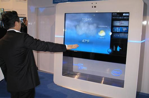
Gesture-based interfaces are the least-common user interfaces. These are accessed when the user gives a camera or sensor a gesture and the system responds with an action. Gestures a user could give a gesture-based interface include waving their hand or pointing their finger. The most common example of gesture-based interfaces are virtual-reality headsets. While many features of gesture-based interfaces and their concepts sound exciting on paper, they don't work in every environment. However, gesture-based interfaces are becoming more common as cameras and sensors become more reliable with recognition, similar to VUIs.
Popular UI Design Styles
The job of the UI designer in web design is to provide the users with a seamless, easy-to-use, navigatable display. With UI designers focused on the interface, they generally have knowledge in graphic design and will know what design styles work best with the website and its target audience.
Skeuomorphism
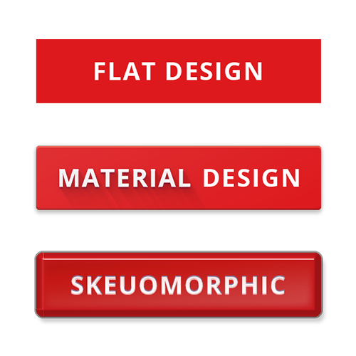
Skeuomorphism defines as making elements on a display such as icons, buttons, and text boxes look like real-world objects they behave similar to. Skeuomorphism offered designers and users alike several benefits, most notably its depth-perception. This is achieved through large shadow areas and glossy textures. This helps users focus on elements that appeared to be “in front” before focusing on elements that appeared to be behind it. Buttons also appeared “pressed-in” when it is in the active state and appears to “light up” when in the hover state. Another benefit of skeuomorphism is showing new web users what each element on the GUI behaved similar to, such as a camera app icon showing a camera or a voice-recording app icon showing a microphone. This was important in the earlier days of technology.
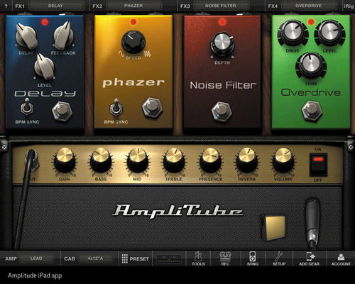
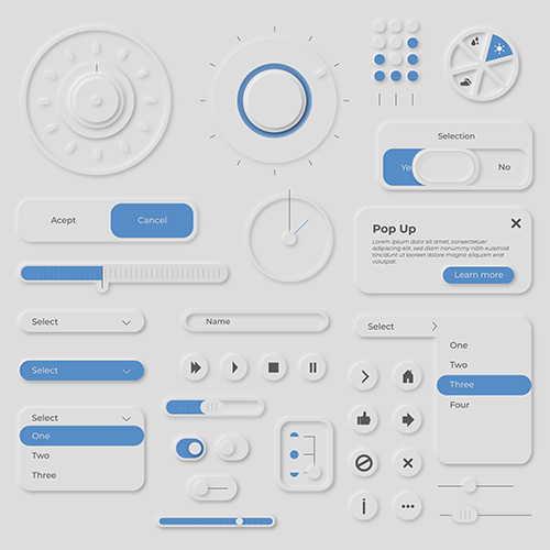
While skeuomorphism offered several benefits, it also has drawbacks that led to its decline after reaching its prominence between 2010 and 2012. While the realistic elements helped show users what the elements behaved similar to, they also proved to be too distracting for users at the time. The primary goal of UI and UX designers is to get users to their solution quick and efficiently. Loading times for skeuomorphic elements are substantially longer than for simpler elements due to their complex nature, meaning systems were often slower. Today, this would not be as much of a problem because of newer processors. It is important to note for future UI or UX designers that skeuomorphism is starting to make a comeback in a style known as “neumorphism”.
Flat Design
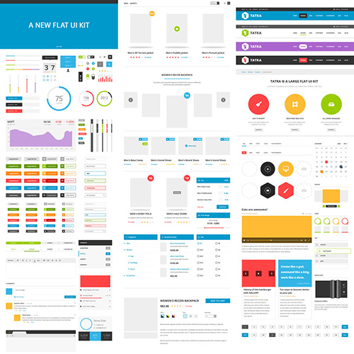
After skeuomorphism arose a newer design trend known as flat design. This UI design technique removes all realistic qualities of skeuomorphism, including shadows and gradients. This provides the users and designers with many benefits, such as simplifying the user interface for a “cleaner” and less-distracting look and easier reproduction of web pages for expanding websites. Loading times became substantially faster because of how simple the elements are.
While the concept of flat design sounds like a good idea, it has several drawbacks. Most notably, depth-perception is removed, and it is much harder for designers to create a sense of hierarchy on an interface without shadows or gloss. While it was popular, users would often be confused as to which buttons did what because they all looked too similar to each other. The difficulty of achieving hierarchy would lead designers to resort to color, with more- saturated colors being used for more important elements and less-saturated colors for less important elements. This made it difficult to provide hierarchy for color-blind people.
Material Design
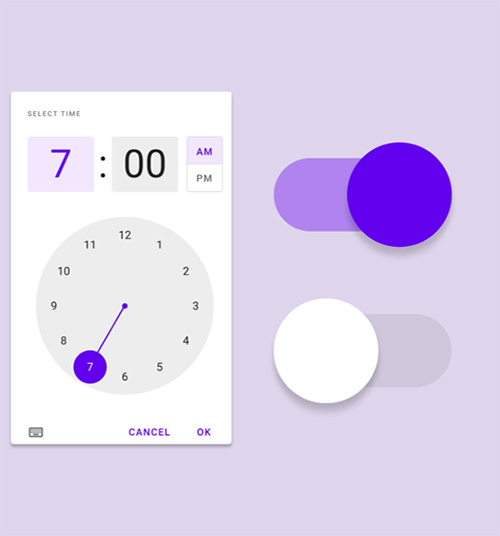
In 2014, Google launched a new grid-based design language that offered a compromise between flat design and skeuomorphism. This language is called “Material Design”. The goal of Material Design is to create a “clean”, “easy” and uniform user interface that would become common across the web. Material Design can be found online at material.io, where anyone can access it. Multiple other websites have access to Material Design as well. The user interface's design is inspired by paper and ink, giving it a flat and skeuomorphic look at the same time. This is not an attempt to bring skeuomorphism back, unlike neumorphism. Instead, it is to use the simplicity and quick nature of flat design and combine it with the depth-perception of skeuomorphism. This makes the interface much more lifelike than flat design, but much less so than skeuomorphism. As design trends keep evolving, Material Design gets new updates. Newer versions of Material Design use more white space as minimalistic aesthetic is popular.
Principles of Material Design
Material Design has four, important principles that make it stand out from other interface design styles:
Material
- Items on the screen behave like how they would in real life. For example, using the cursor to move a piece of paper from right to left would move the paper at a consistent pace with the cursor rather than too fast or too slow.
Bold and graphic interface
- Because Material Design is a grid-based language, elements can be placed in front of or behind other elements. In addition, bold, bright colors are used to give the webpages a strong personality. Similar with flat design, brighter elements generally put elements in front of desaturated elements.
- The typeface the designer chooses is also important. It must be strong, yet easy to read. Don't choose one that is too thin or so big it intimidates the users.
Motion with meaning
- Generally, the designer should not include too many animations since the human eye is drawn to movement. However, it is a good idea to add subtle animations that last between one and two seconds for items that the user is supposed to be aware of. This includes buttons when they become available or navigation menus they just opened.
Usability
- The interface should be easy to use, and the user should instinctively know how to use it. Use universal icons that are found on other websites when they are appropriate. Subtle shadows should be given to important elements to create a sense of hierarchy, but not so much it distracts the user from reading everything else. The webpage's design should seem “transparent” to the user as its job is to direct the user to their solution.
Best Approach for UI Design
With there being three major design trends in the past 15 years, the question that arises is which UI design approach is best. The answer depends on the needs of the target audience and which one suits the company's branding. Generally, it is important to keep the design “transparent” as this helps users get their job done quick and efficiently. However, it is important to provide the right amount of depth-perception, which can be achieved using subtle shadows. Greater hierarchy should be given to titles, headings, images, and videos rather than body text. According to Fitt's Law, elements should be spaced within a comfortable distance from where the cursor would likely be, and if it is further, the element in question should be larger so they are closer.
Material Design is a source for designers, both new and experienced, that offers a relevant array of elements and styles. It can be accessed at material.io.