Design Template by Anonymous
Using Color in Web Design
Now that we've covered both color psychology and how to create color harmonies, the remaining question left unanswered is, how do we use this knowledge to incorporate colors effectively into our web designs?
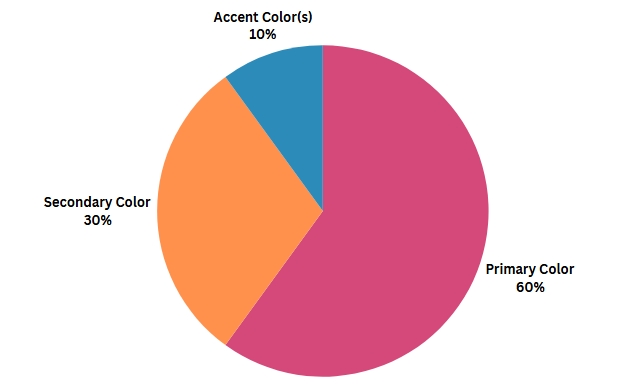
The 60-30-10 Rule
This rule is widely used across design disciplines as a guide to balancing the use of each color within a design palette. While the name of the rule may misleadingly imply that it can only be used with a maximum of three colors, this is certainly not the case. The rule implies that one color should be the primary color and make up approximately 60% of the design, a second color should be the next most prominent color and make up approximately 30% of the design, and one or more color(s) should be designated as the accent color(s) and will make up the remaining approximately 10% of the design. At least loosely following the 60-30-10 rule is an easy-to-follow trick to ensure that your users' focus can be effectively drawn to the aspects you want to highlight, such as buttons, and away from the aspects you want to blend in, such as the background. If you use all of the colors in your palette equally or in similar ratios, you run the risk of your design appearing busy and, therefore, your users struggling to easily identify what parts of your site they should be focused on.
Tools for Color Selection
The human eye can perceive only a limited number of the total possible colors that can be created, and this number is even smaller for those who have vision below the standard 20/20 benchmark or who have a variation of color blindness. But even for those who have fantastic vision, identifying colors that have the same saturation and the same value can be incredibly difficult, especially for those with limited experience doing so. For these reasons and various others, using digital tools to assist in the color selection process can be incredibly helpful when designing the color palette for your site. The following are a few tools that can assist you in your color selection process:Tools for Accessibility and Inclusivity
Building accessible and inclusive websites is an entire topic all on its own, but I felt that it was important to briefly discuss a couple of helpful tools for maintaining accessibility and inclusivity within your site design that are specifically related to color applications. The following are two resources I highly recommend exploring and utilizing whenever applicable:
Three Key Guidelines for Selecting YOUR Site Colors
When considering how to select the colors you should use for your web design, there are three rules that you should remember that incorporate all of the topics discussed in this tutorial in a brief summary:
- Create your business persona
- Determine your target audience
- Analyze competitors
Before selecting any colors, it is important that you have determined your business persona and what messaging you want to be associated with your brand. Once you have determined this, you can easily select at least one color that aligns most closely with this messaging, using what you now know about color psychology, and move forward by building your palette around this focal point.
Once you have selected your key messaging color, it is important to cross-check to ensure that the message you're intending to send is going to be received appropriately by your target audience. Factors to take into consideration concerning your audience are age and generational trends, cultural traditions, environmental variables, and current events relevant to your audience.
Do research on what other brands and companies in your industry are using for color palettes and how their strategy is positively or negatively affecting their success. Specifically, look at other companies in your industry that are experiencing stable, consistent, and ideally increasing growth and consider whether the color associated with their brand would align well with the messaging of your company. It is certainly okay to take a unique approach or to decide that the messaging you want to convey doesn’t necessarily align with most other companies or services within your industry, but it is also important to keep in mind that if there is a common color palette trend across many successful sites, their use of color could be playing a significant role in that success.