Design Template by Anonymous
Creating Color Harmonies
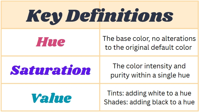
Before we move on to discussing how exactly to incorporate colors effectively into your web designs, it's important that we discuss some key techniques to creating color harmonies, which are pairs or sets of colors that work together to create a cohesive design. The techniques used to create color harmonies are specifically referred to as color nuances. To understand the four color nuances we are going to cover, it is important to first understand three basic color-related terms: hue, saturation, and value. If you aren’t familiar with these terms, I highly suggest that you refer to the table below. Otherwise, feel free to move further down the page to the list of color nuances.
- Complementary Colors
- Analogous Schemes
- Monochromatic Schemes
- Triadic Schemes
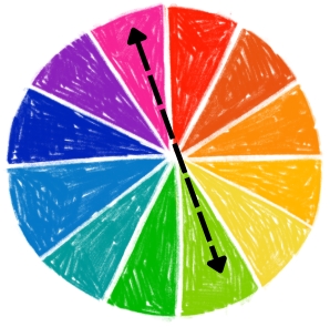
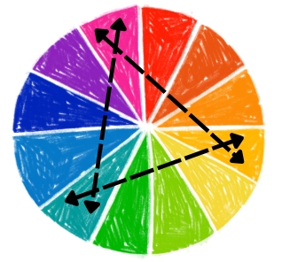
These color pairs are made up of two colors that can be found exactly opposite of each other on the color wheel. Complementary colors will always be of different hues but must have the same saturation and value.
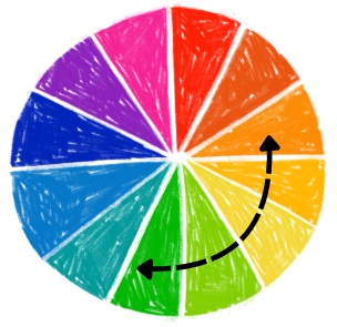
These schemes are comprised of a set of colors, typically ranging between 3-5 different hues, that can be found directly next to each other on the color wheel. Amongst the set of colors, there will be different hues that are typically of the same saturation and value, however, there is flexibility regarding saturation and value levels when using this scheme.
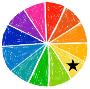
These schemes are comprised of exactly one hue that is represented in many different variations of saturation and value to create as many different colors as is desired for the scheme. Neutral colors that aren't the selected hue, such as white, black, or gray, can also be included in the monochromatic scheme as long as the variation is cohesive to the rest of the scheme.
These schemes are comprised of exactly three colors that form an equilateral triangle when lines are drawn between them on the color wheel. Each color will be of a different hue but must be of the same saturation and value, similar to complementary color pairs.
While these four examples do not come close to being inclusive of all the nuances that exist, they provide a good representation of how creating color harmonies can be accomplished and be used. They are also great beginner approaches to lean on as you begin working on effectively incorporating color into your web designs.
Semantics Colors
Semantics colors are a set of universally agreed upon colors, or an alternative key of colors designated by the designer, that each represent a designated category of messages or response that the developers want to communicate to the users. This set of colors does not necessarily have to be a part of the color scheme. In fact, they are very often more effective when they are colors that are alternatives from those found in the site's primary color palette. The most commonly used set of semantics colors are red, orange, green, and blue. Please refer to the table below for details about what types of messages or responses each color is typically designated to represent.