Design Template by Anonymous
Color Systems
Three Color Rule
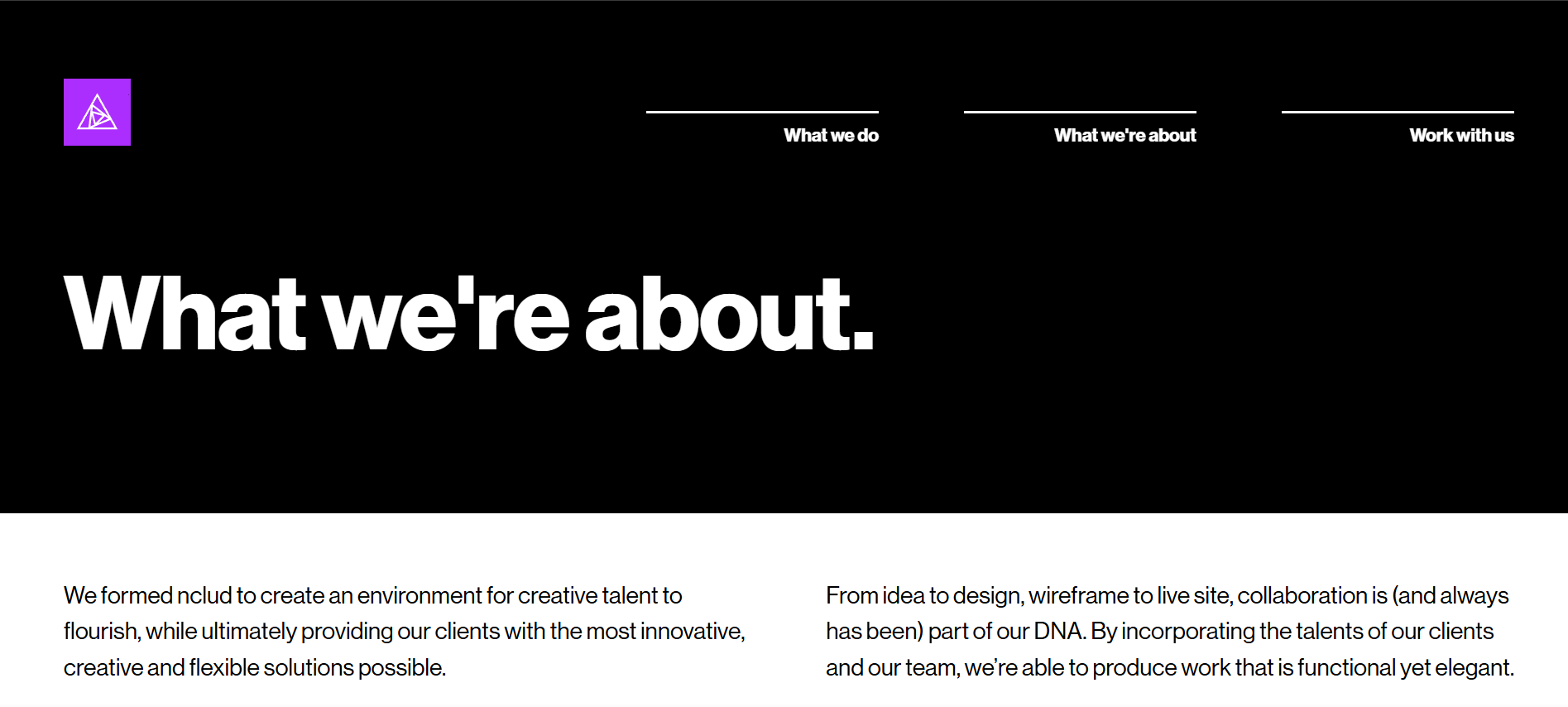
When implementing your color palette it is important to limit the scope of which you utilize each of your colors. A common technique used is the three color rule. The three color rule usually pertains to ustilizing 60% of your main color, 30% of your second color and 10% of your third color. Below are a few examples portraying how this can be implemented in various website designs.
Relativity of Color
The relativity of color refers to how color changes based on the context it's used in. This is one of the most important concepts of color theory and can help create a strong foundation of how to make a design pop or standout from its surroundings. A very common and simple example is the relativity of dark gray within a black background context or a white background context. As you can see, the dark gray appears lighter within the black background and darker within the white background despite being the exact same color.

It's important to know that while color is relative in a general sense, it is especially relative when there is a strong contrast of value. Here are some more common examples and concepts on color relativity.
The Flushing Effect
This effect typically happens when one color next/close to another color takes away that color's characteristics. This can typically be seen when there is a lack of contrast between two colors, making one color harder to standout from another. This effect also has accessability concerns especially when this happens with text involved and will be explained more in page 4. Below is an example of both a light green and a light grey having their intensities taken away due to the higher saturated lesser-contrasted backgrounds.

Simultaneus Contrast
Simultaneus contrast is when one color is placed in two different contexts but those contexts make the color appear differently from one another or makes it appear as if it’s two seperate colors entirely.

Light Intensity
Light intensity is a way of showing the relativity of a color's lightness. It’s important to note that no matter how bright or light a color may be it will always appear darker when put next to white. Below are two examples showing minimum and maximum contrast of light intensity. On the left it shows maximum contrast with the darker color on the lighter ground everything is very defined and it’s easy to tell where the edges of the square are. The right shows minimum contrast of two different colors but with the a similar amount of light intensity, things become less defined and it becomes challenging to make out the square.

What Not To Do
Don't Use Too Many Colors
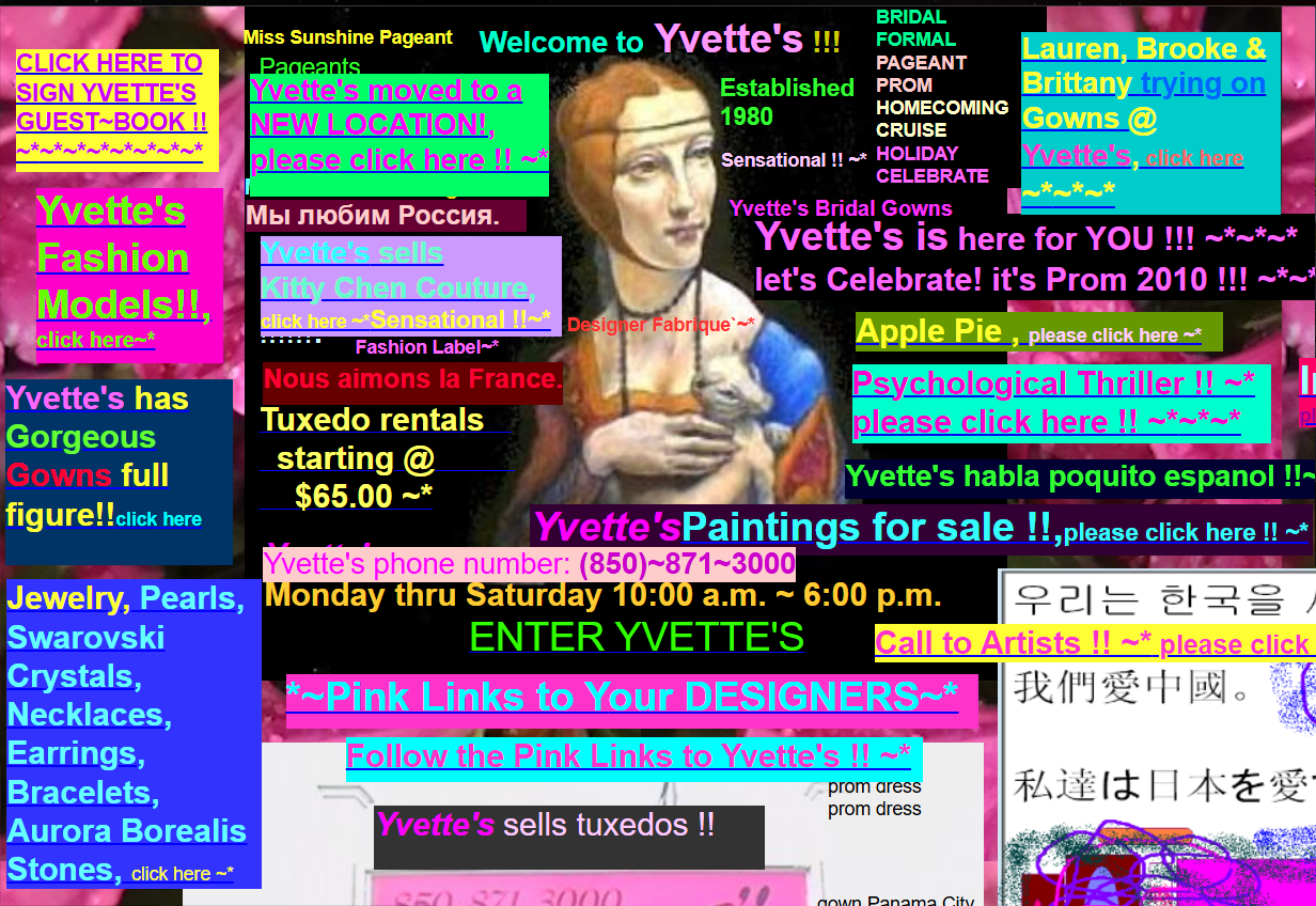
As stated before, it's best to use as little colors as possible. Too many can make a site appear too "busy" and make it frustrating for users. Where should they click to do a specific action and what is the most important part of the site? These questions will typically be left unanswered or be ambiguous with the use of too many colors fighting for the user’s attention. Below is an example of a website using too many overly-saturated colors and showcasing how hard it can be to know where to look.
Be Consitent With Your Color Scheme and Use of Colors
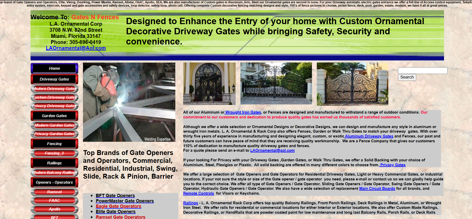
In website design, it’s important that you stick with your chosen color scheme thoughout the site and to not add random colorization to random elements throughout the page. This helps gives the site recognizability to its users, telling them which buttons are important and which ones aren’t as much. This example below shows a very uncoordinated color scheme being used, with random blues and reds highlighting seemingly random text and the navigation having different links highlighted with wither black, red or blue with no coordination being shown with these colors. It makes it hard to know what each color is trying to tell the users and the purpose of why one link may be colored red and another be colored blue.
Don't Use Too Little Contrast
As talked about before, having colors next to eachother with similar values make it difficult to make out where one object ends and the other object begins. Below is an example from Apple’s website showing the navigation header. The "support" section of the header was clicked on but the lack of contrast between the clicked on word and the rest of the unclicked words makes it difficult to tell which section we are actually in based soley on the header. Having a higher contrast between the clicked on word and the rest of the words would having helped us be able to tell which page we are actually on.
