Design Template by Anonymous
Accessibility of Color
How to Make Color More Accessible
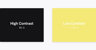
About 4% of the world population have low vision and 4.5% experiance some form of color blindness. It's important to recognize the impact that color plays in the usability and accessiblity of a website’s design for people who are affected by these conditions. For example, Using a higher amount of contrast in important parts of your design, such as with the text and buttons, can help improve readability when it comes to people that experiance low or blurry vision. Testing the usage of colors in your design for the most common types of color blindness people have is also very important in making sure that everyone is able to see and use your design the way you inteneded.
Popular Color Associations
Colors play a significant role in your site or brand identity. Utilizing common associations found with different colors can help emphasize what your site is and put meaning behind the color being utilized. Here are the following most common color associations.