Design Template by Anonymous
Elderly or Inexperienced Accessibility
An Often Overlooked User
When the topic of web accessibility is brought up, our minds immediately jump to users with some sort of disability that limits or changes the way that they interact with web pages. But accessibility is about making websites usable for everyone which includes people who are very inexperienced with using and navigating the internet. Here are some examples of how we can make websites more accessible for this type of user.
Text Size
Elderly users along with users who may not have the best English, or whatever language the web page is, reading skills may want larger text size. Even without vision loss or visual impairment, many users prefer working with larger text. Some websites directly integrate font size options in their coding. However, most websites opt to use accessibility widgets to allow the user to customize font size, font colors, along with countless other features that I will cover later.
Book/Newspaper Reading Style
This is a really interesting way to increase readability for users who are more familiar with printed media. For example, my grandfather used to print websites to store them but also because he couldn't stand reading on a cluttered computer screen. Implementing a feature like this into a website would be extremely challenging, thankfully website creators can leverage two resources, accessibility widgets and Google Chrome Reading Mode. As previously mentioned, accessibility widgets can offer so many amazing accessibility features including a reading mode. Google Chrome actually has a Reading Mode feature built in that reduces image clutter and presents the text in an easy to read format. The issue is that most users who would benefit most from this Chrome feature would likely have trouble discovering the feature even exists, which is why the accessibility widget is superior.

Simple and Effective Navigation
One of the first steps in ensuring a website is accessible is addressing the navigation. Navigation should minimize the amount of clicks necessary. Drop down navigations are an example of potentially confusing and complex navigation that should typically be avoided. A simple, yet often overlooked way to use drop down navigation in a more accessible manner is by allowing the navigation label to be clicked. For example, on a clothing store a more experienced user would hover over the "MENS" navigation then select "T-Shirts" from the drop down menu. An older or less experienced user would likely just click on "MENS". You would be astonished how many websites do not program this and require users to interact with the drop down menu. Having simple labels is another way to drastically improve the experience of less internet-savvy users. A search bar is also extremely useful for users who already know what they are looking for.

Easy to Understand Icons
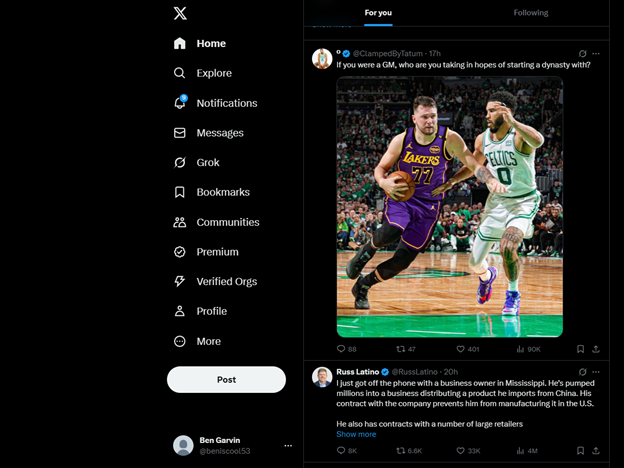
Using universally understandable icons is an important aspect of web design that is often overlooked. When used correctly, icons transcend language, age, and web experience. To test if an icon is simple and intuitive, simply remove any text associated with the icon and ask a friend or potential user what they would expect if they clicked that icon on a website. Proper icons can turn using a website from a daunting, confusing task into a far more intuitive and easier one. See below a screenshot that shows a great example of intuitive icons.

Minimize Scrolling and Hyperlink Best Practices
Requiring users to scroll an excessive amount can be frustrating to older users. This goes along with keeping websites simple and compact. The reason that this is so frustrating for older users in particular is because they often read over the entire website before acting. Ensuring that web content is compact and split between multiple pages helps them read through the website easier and faster. Ensuring that web authors follow hyperlink best practices is also extremely important particularly for older users. Important practices like underlining clickable links and changing the color of links after being visited should always be followed. These help all users easily identify links and help people with short-term memory loss not get stuck in a loop of visiting the same link repeatedly. Elderly users are also more than twice as likely to leave a website if it doesn't work as they intended compared to younger users.