Design Template by Anonymous
Cognitive Disability Accessibility
How to Make Websites Accessible for the Cognitively Impaired
To do this we first need to define some common cognitive impairments. Some of the most common cognitive impairments are ADHD, dyslexia, memory loss or dementia, and learning disabilities. I will be covering some common ways in which web designers can create websites that are accessible for people with these disorders.
Color Contrast
Color contrast is a simple but important accessibility practice that should be adhered to. Color contrast can impact many different types of users including color blind, visually impaired, elderly, and dyslexic users. Color contrast typically comes up with respect to background and text colors causing reading difficulties. Color contrast is generally common sense, but it becomes slightly more difficult when thinking about color blind users. See below an infographic that shows many different examples of good and bad color contrast.

Reduce Clutter
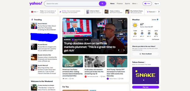
Individuals with attention and/or learning disorders can often find it challenging to stay engaged with one aspect of a web page. Many websites cram as much information, news, articles, or whatever else into the frame. This makes staying on topic extremely difficult for some users. Decreasing the amount of clutter on the page along with using a sleek, simple design has been shown to improve focus in users. See below an image of the Yahoo! home page which is an example of how cluttered and overwhelming some websites can be.
Avoid AutoPlay, Animations, and Pop Ups
One of the key aspects to retaining individuals with cognitive disorders is to make your website predictable. Many of these users will go to a website with a goal in mind, but then often get distracted by unexpected experiences that they run across on the website. Some examples are autoplayed videos, animations, and pop ups. All of these come unexpectedly to users and can distract them from their original goal. Many websites intentionally add pop ups or autoplayed videos for this exact reason. But professional and academic websites should not use these tactics or if they do, use them sparingly.

Highlighting and Reading Guide
Two underutilized features that can improve retention and comprehension for all users are highlighting and reading guides. Highlighting is self-explanatory, users can highlight important content that they want to revisit. Reading guides can take many forms but one of the most common is placing a horizontal line across the page where the user's cursor is. This helps the user keep focus while reading and also helps reading without losing track of which line you are on. This is one of the best features for users with dyslexia, the most common learning disorder in the United States. Similarly to many other accessibility features, this feature is included in most of the accessibility widgets available on the internet.