Design Template by Anonymous
HCI Applications to Web Design
Utilizing HCI: What's the difference?
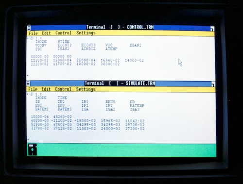
Without HCI, a website looks a lot like a terminal, or command line interface. Something designed for a computer to understand and interpret, not for a human to use and interact with. This is not exemplary of good design because the user must be an expert to learn how to interact with the interface.
Without (or very little) HCI

In the image above, from 1987, it shows a computer interface. While everything is written out for the user to see, it is still not the most ideal or efficient way to design something for a person to use. Nothing is really intuitive, and while there are some colors used to draw the user’s eye, it essentiallly looks like a spreadsheet, and doesn’t stray very far from the traditional way a terminal or command line interface looks.
HCI Applied
Take a look at most websites today, and you’ll see the principles and concepts of HCI already within it.

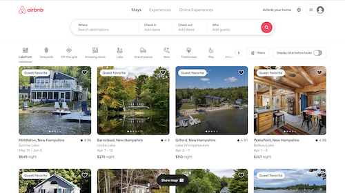
In the image above is Airbnb’s user interface. Notice the use of color, shape, images, and what the user is actually viewing on the first page. The search bar shows up at the top, with the field for a destination a user wants to visit showing up as a subfield first. The search button is bright and red, and the tiles of options in the user’s current location show up, in the instance they have arrived at their destination or are seeking an option in the place they already live.
Web design
For web design, there are three things to consider when implementing Human-Computer Interaction:
Needfinding
Needfinding is having a strong sense of what the target audience actually requires. For example, if it is an e-commerce site, having a place to view a summary of all the things they want to buy is essential, which is why most online stores have a shopping cart button. There are a few ways of determining the needs of a user. A company can send out surveys, do in-person surveys, or do other methods of target audience analysis.

In the image above is Airbnb’s user interface. Notice the use of color, shape, images, and what the user is actually viewing on the first page. The search bar shows up at the top, with the field for a destination a user wants to visit showing up as a subfield first. The search button is bright and red, and the tiles of options in the user’s current location show up, in the instance they have arrived at their destination or are seeking an option in the place they already live.
Determining Tasks and Roles
To determine tasks and roles, the designer must understand what the user will be doing on the site. The designer needs to consider every single possible thing that the user might do, and then design accordingly. This prevents 404 errors and confusion.
Prototyping, Testing, and Iteration
Prototyping is essentially creating a rough sketch of the interface. This can be done in a few different ways, with vary levels of fidelity. The higher the fidelity, the longer the prototype will take, which is not the point of a prototype. This can also constrain and limit the designer, and make it harder to change things later on if they don’t work due to attachment the creator of the prototype might feel towards it. That’s why an in-between approach, somewhere in the middle of a sketch on paper and a working wireframe, is the best place to be. Not every button might work, but the purpose is to create a visual. Testing is then testing that prototype to see if it is actually effective as a site. Iteration is making small, incremental changes, going back to the prototype, and testing again. It is a cycle that continues even after the site has been deployed.