Design Template by Anonymous
Principles of HCI
What good design actually is
“Good” design is something that many people have opinions about and may be able to point out, but not necessarily describe. The concepts for good design can vary based on the usability of the thing being designed, but even purely creative projects have attributes that make them good. Is it original? Is it saying something? If it is saying something, how is it communicating that in an effective and impactful way? You can think about these questions when standing in front of a painting at a museum, or while viewing a website and they will still apply.
HCI is about usability for humans to interact with technology. Good design implements many aspects of good graphic design, with the caveat of including established web design standards. An example of an established web standard is underlining text to indicate that it is a link. If one were to underline text and have it not be a hyperlink to something else, the user will waste their time clicking on it as if it is one. It is generally inadvisable to break standards like this to avoid confusing the user.
An important aspect of good design is discoverability. This means whether or not the user can understand what they can accomplish and how they can execute it. The attributes of this are:
Affordances
An affordance is the relationship or interaction between a human and whatever they are using. The relationship between the two is the affordance itself; it reveals what the user is capable of doing and what the object actually does. Together, it shows how to use the object or item.

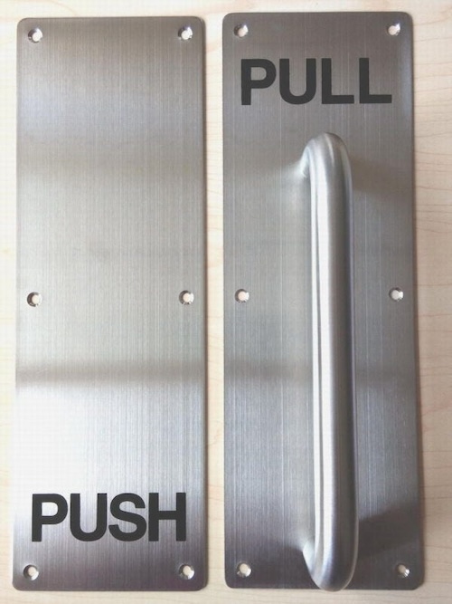
If you’ve ever had the slightly embarrassing moment of pulling a push door or pushing a pull door, blame the designer. If there’s a handle you should pull it, and whoever put the handle there thinking you need to grab onto something attached to a board on a hinge doesn’t understand how doors work. The affordance in the image above isn’t necessarily captured by the image, it’s in the reaction you might have had upon viewing it. You push on the door that looks like the right, it pushes, you leave. That interaction is the affordance itself.
Signifiers
Signifiers are similar to affordances and are often confused for them. To put it simply, signifiers are the visual indicators to allow for affordances to occur correctly. The word “correctly” is used here because a designer ideally wants the user to not be confused when interacting with something they made. In the door handle image used earlier, the signifiers are the metal plate used for a push door and the curved handle used for a pull door. The metal plate indicates that the door can only be manipulated by pushing that part of the door, meaning it can only be swung forward – that is the only way to open it. The handle indicates that there is something to be pulled because the user must physically pull the door on its hinges to open it. Signifiers are useful tools to communicate what the user should do, and must be clear immediately.
Mapping

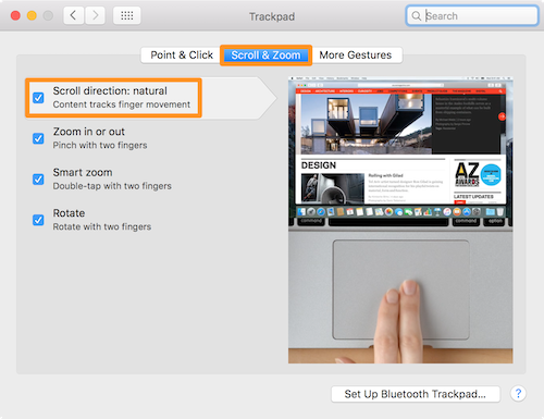
Mapping is the meaning of where certain aspects of a design are placed visually. Why is this button next to this one? What does that indicate? A classic example of this is the act of scrolling. On a trackpad, you can either swipe your fingers up from the bottom of the trackpad to move the page down, or swipe your fingers down from the top of the trackpad to do the same thing. The user changes this based on their preference, which is indicative of how they think of using the computer and viewing their screen. Natural mapping is making the choice obvious. If the lever for a machine is tilted downwards when it is off, the natural mapping indicates that the lever must be pushed up to turn on the machine.
Feedback
Feedback is for the user by the object. It is about providing an indication to the user that they’ve done something correct. Imagine how frustrating things would be to use if there was no visual indicator after you interacted with it: you press a button, nothing happens; you enter a command, nothing shows up; you flick a switch, silence. Feedback is how users are able to know that they are using the object or product correctly and are accomplishing their task. It is also a way for the user to understand what to troubleshoot in the instance something actually isn’t working on their end, or when something is broken.

Feedback is also a balancing act. Too much of it can cause annoyance to the user, especially when the task they were hoping to accomplish still hasn’t happened. Avoiding unclear feedback indicators is also important, to avoid confusion over what something might mean. Light indicators are often the culprits of this – what’s the significance of a blue light versus a yellow light? What if there’s a green light glowing but nothing is happening? Manuals or some sort of explanation should always be supplied in this instance, but the best design is self-sufficient.
Another aspect of good design is understanding. This means the user knows what the product is, what it’s supposed to do, how to use it, and what each controllable action does.