Design Template by Anonymous
Typography Fundamentals
Typefaces vs. Fonts
Many people use the terms typeface and font interchangeably, but they refer to different things. A typeface is the design of a set of characters—it’s the artistic concept. For example, Arial or Times New Roman are typefaces. A font, on the other hand, is a specific style and size of that typeface—such as Arial Bold 16pt. Think of a typeface as the song, and the font as a particular performance of that song.
Font Classifications
Fonts are typically categorized based on visual traits. These classifications help designers select appropriate fonts for different purposes:
- Serif: Traditional fonts with small lines or strokes (serifs) at the ends of characters. Common in print and professional websites (e.g., Georgia, Times New Roman).
- Sans-serif: Clean, modern fonts without serifs. Easier to read on screens and often used for body text online (e.g., Arial, Helvetica, Roboto).
- Monospace: Every character takes up the same amount of space. Common in code editors and developer-focused content (e.g., Courier New).
- Script: Stylized fonts that mimic handwriting. Best used for decorative headers or logos—not body text.
- Display: Bold, attention-grabbing fonts used for large headlines or visual impact. Use sparingly to maintain readability.
Type Anatomy
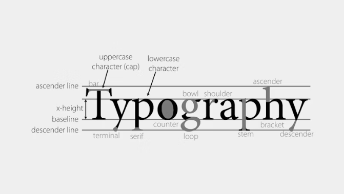
To understand how fonts work and how to compare them, it helps to know the basic parts of letterforms:
- Baseline: The invisible line on which most letters sit.
- x-height: The height of the lowercase letter “x” in a font. Affects how readable the text appears, especially at small sizes.
- Ascenders: The parts of lowercase letters that extend above the x-height (like the top of “h” or “d”).
- Descenders: The parts of letters that dip below the baseline (like the bottom of “g” or “y”).
- Cap height: The height of uppercase letters in the font.
Font Mood and Tone
Typography isn’t just about readability—it’s also about emotion. Fonts have personality. Choosing the right typeface for a project helps support the message and brand. For example:
- A playful handwritten script might work well for a children’s brand or a personal blog.
- A sleek sans-serif typeface communicates professionalism and minimalism—perfect for tech startups or portfolios.
- A serif font with a strong vertical contrast might feel authoritative, elegant, or academic—suitable for law firms or universities.
Understanding font tone helps designers make purposeful choices and avoid sending mixed messages to users.
Hierarchy and Emphasis
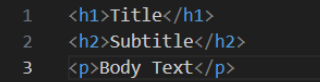
Hierarchy refers to how we guide the viewer’s eye through a page. Typography helps create this hierarchy through the use of different font sizes, weights, and styles. Headlines, subheadings, body text, and captions should all feel distinct yet cohesive.
For example, using a large, bold header (like font-weight: 700) followed by a smaller, lighter paragraph (font-weight: 400) naturally draws attention to the most important information first. Size, spacing, and color contrast also play a big role in typographic hierarchy. Done well, it helps users scan and digest content more easily.