Design Template by Anonymous
How to Choose and Pair Fonts
Pairing fonts might sound like an artistic decision — and it is — but it also follows logic and strategy. In web design, choosing fonts that work well together impacts everything from your site’s visual rhythm to the tone and readability of your content. Effective font pairing enhances hierarchy, creates visual interest, and reinforces the message your brand is trying to send.
Contrast in Font Pairing
One of the easiest ways to pair fonts effectively is through contrast. Fonts that differ in style but complement each other help create distinction between content types without clashing. A popular and safe contrast method is combining a serif font (like Merriweather or Lora) with a sans-serif font (like Open Sans or Montserrat). Serif fonts often feel classic and traditional, while sans-serifs feel clean and modern. This contrast supports hierarchy and improves readability.
Other contrasts include weight (bold vs. light), case (uppercase vs. sentence case), or tone (formal script paired with a neutral body font). For example, a bold display font used for headings can pair well with a light sans-serif for body content. The trick is to find balance — don’t make them too similar, but don’t pick opposites that fight for attention either.
Using Fontjoy to Generate Pairings
Fontjoy is a free online tool that helps designers explore font pairings quickly. It uses machine learning to generate combinations of fonts from the Google Fonts library. With Fontjoy, you can lock a specific font and shuffle pairings until you find something that works. This is a great way to experiment and see how different combinations look in real time before committing them to your site.
Try this simple workflow:
- Visit Fontjoy.com.
- Click the shuffle icon to generate a random trio of fonts.
- Use the lock icon to keep one font while trying new combinations for the others.
- Preview heading, subheading, and body text roles side-by-side.
Since Fontjoy pulls fonts from Google Fonts, you can directly copy the embed code and apply the font families in your CSS with ease.
Visual Hierarchy via Pairing
Pairing fonts isn’t just about aesthetics — it’s also about guiding the user’s attention. Establishing a strong visual hierarchy means users can easily scan a page and understand what’s most important. Use bold, unique fonts for headings to grab attention, and simpler fonts for paragraphs to encourage long reading.
Consider differentiating with:
- Size: Large for headers, smaller for content.
- Weight: Heavier text for emphasis or key areas.
- Style: Italic or caps for quotes or captions.
Common Mistakes in Pairing
Some common pitfalls in font pairing include:
- Using fonts that are too similar: This offers no contrast and makes it hard to differentiate between elements.
- Using too many fonts: Stick to 2–3 fonts max. More than that can overwhelm and confuse the user.
- Inconsistent styling: Reusing fonts inconsistently across pages makes your site feel scattered.
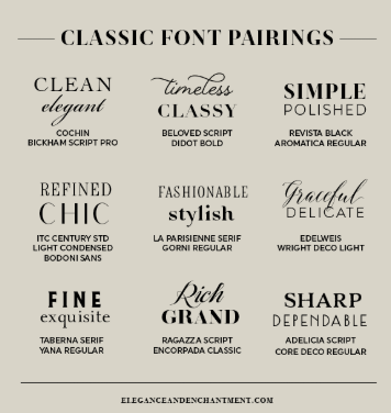
Examples of Font Pairings in the Wild
Many modern websites apply thoughtful pairings. Tech blogs often use clean sans-serif headings (like Roboto) with readable serif bodies (like Georgia). Creative portfolios may go bold with display fonts for headers and stick to simple sans-serifs like Raleway for content. These combinations help create mood and clarity.
You can also find inspiration from curated collections in Google Fonts and services like Google Fonts Pairings. These show how fonts behave in real layouts, which helps you judge whether the combination will suit your specific project.