Design Template by Anonymous
What is Typography in Web Design?
Typography is the art and technique of arranging type. In the context of web design, typography involves the thoughtful selection and styling of fonts to enhance the appearance, readability, and usability of text across digital interfaces. Though often overlooked by beginners, typography plays a central role in how websites communicate visually. It influences not only what a website says but also how that message is perceived. It is the bridge between written content and user experience.
From headlines and navigation menus to paragraphs and buttons, text makes up the majority of content on most websites. How this text is styled—its size, weight, spacing, and even alignment—can deeply impact how users feel while interacting with a site. Typography can make a website feel professional or amateurish, trustworthy or disorganized, modern or outdated. Designers use typography to evoke emotion, convey tone, and ensure that content is accessible and enjoyable to read.

Why Typography Matters on the Web
Effective typography in design accomplishes three key goals: it provides clarity, adds visual interest, and supports communication. These pillars are especially important in web design, where users quickly scan pages and form split-second impressions. Clarity ensures the content is readable and understandable, interest makes it visually engaging, and communication ensures the message aligns with the brand’s tone and purpose.
You could have the most insightful content online, but if it’s displayed in small, cramped fonts with poor spacing and weak contrast, users are likely to ignore it. Typography helps users navigate content and understand what matters most on the page. Through smart use of font size, color, and layout, designers establish a visual hierarchy that guides the user’s eyes from headline to body text to calls-to-action.
Intentional use of typography helps build trust and recognition. When fonts are consistent, easy to read, and well-aligned with the website’s identity, users are more likely to view the site as credible. Typography can elevate the professionalism of a site and make it more accessible to a broader audience, including users with visual or cognitive impairments.
Examples of Good and Bad Typography
For bad typography, Picture a website using five different fonts, inconsistent sizes, and pale gray text on a white background. It’s chaotic and frustrating. Now imagine a clean design with two well-paired fonts, consistent sizing across headers and body text, and strong color contrast. It feels cohesive, calming, and trustworthy.

Good typography invites users to engage with content. It doesn’t distract—it enhances. Font pairing, spacing, and alignment all play a role in how readable and inviting a page is. When a site maintains a thoughtful typographic system, it feels easier to use. In contrast, poorly styled text can create friction and drive users away, regardless of how good the underlying content may be.

Challenges in Web Typography
Typography on the web comes with unique challenges. Unlike print, where dimensions are fixed, web typography must adapt to many screen sizes, resolutions, and environments. This includes everything from mobile phones and tablets to large monitors and accessibility tools. To manage these variables, designers rely on responsive typography techniques and flexible CSS units like em and rem to ensure that text scales smoothly and remains readable across devices.
Font loading is another concern. Custom fonts can improve design but may slow down page load times if not handled properly. It’s important to use font-display strategies that ensure fallback fonts appear quickly if a custom font takes time to load. Additionally, designers should always test how their font choices render across browsers and operating systems to catch inconsistencies.
Accessibility is essential. Fonts need to have enough contrast against their backgrounds, and text must be scalable without breaking the layout. Avoid overly decorative fonts for large blocks of text, and ensure that all users can resize text comfortably. Following established accessibility guidelines helps ensure a better experience for everyone.
Why Learn Typography as a Web Designer?
Typography is one of the most important skills a web designer can learn. It affects almost every aspect of a website—from branding and layout to usability and accessibility. A strong foundation in typography enables designers to make informed decisions that not only enhance a site’s look and feel but also improve how effectively it communicates with users.
Fonts carry emotion and tone. Choosing the right font for a project reinforces the message being communicated. A friendly sans-serif might work well for a tech startup, while a traditional serif might suit a law firm or university. Learning to evaluate and select fonts with purpose helps designers create more meaningful and polished websites.
Understanding typography also strengthens collaboration. Whether you're working with content strategists, developers, or clients, being able to explain the reasoning behind your type choices builds credibility and ensures consistency. It also helps bridge the gap between visual design and the user experience, ultimately making the final product stronger.
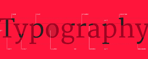
The rest of this tutorial will dive deeper into the core concepts behind web typography. We'll start with type anatomy, font categories, and fundamental terminology, then move on to how to implement typographic styles with CSS, pair fonts effectively, and follow best practices to ensure a smooth, beautiful, and accessible reading experience.