Design Template by Anonymous
Web Accessibility for the Visually Impaired
Overview of the Issue
There are an estimated 285 million people worldwide who are classified as visually impaired. This estimate includes those with color blindness, low-level vision, and blindness. Color blindness is the most common visual impairment, which affects 8% of men and 0.5% of women. The most common forms include deuteranopia and protanopia which are reductions in sensitivity to green and red light respectively. Low-level vision includes a wide range of symptoms including poor visual acuity, meaning vision is not sharp or finely detailed, tunnel vision, which is a loss of peripheral vision, central field loss, which is only seeing peripheral vision, and clouded vision, which is a general blurriness across the visual field. Blindness can be classified as a more substantial form of low-level vision that makes one unable to function without personal or technological assistance. Unfortunately, since the web is commonly an inherently visual experience, there are tons of sites, tools, and apps that are poorly designed, leaving them unusable to those with these kinds of visual impairments.
The Importance of Color
Contrast
Contrast is an extremely important element to consider when choosing the colors displayed on your site. For those with visual impairments, low contrast ratios can make it difficult or even impossible to see the text displayed on the page. Luckily, there are standards placed by the WCAG, or Web Content Accessibility Guidelines, for sufficient contrast ratios to promote readability. The WCAG AA rating, representing the legal requirements, requires a ratio of 4.5:1 for normal text and 3:1 for large text, meaning the brighter color is 4.5 times brighter or 3 times brighter respectively.

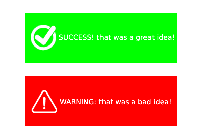
Do Not Rely on Color to Communicate Information
It is a common practice to incorporate notable color changes in things like alerts, warnings, or separations of content on a website. Although these can be helpful to able-bodied users of the site, color-blind users are missing the message if there are not other cues present to indicate this information. Some examples of cues can be imagery like warning icons, patterns, shapes, or even text-based explanations to avoid this confusion that can come to color-blind users. A great example of this is underlined links. While links are often styled with a blue color, the underline itself serves as a universal indicator, which ensures that users can recognize them regardless of their ability to perceive color.
Screen-readers
Screen-readers are a form of text-to-speech software, which translates the language found on a webpage to plain text and then reads it aloud line by line, progressing through the page as it goes. Although this is an amazing software that immensely helps the visually impaired population, it does create its own set of problems. By forcing the user to skim through the page linearly, they have to use intense focus to avoid missing their sought-after content from popping up. This creates a process that is far more time-consuming than what the average able-bodied user experiences on the web. Luckily, there are methods in place to ease this process for users of this software.
Provide Alt-Text for Images
Alt-text is an opportunity to give a brief description of an image found on a webpage. When a screen-reader comes across an image, it will read this alt-text aloud to the user to give them context of what is happening on the page. Images that do not contain alt-text will be skipped over, and the users of the screen-readers will have no idea what they missed. A good suggestion for developers is to remember to stay to the point and keep their wording brief with alt-text, as screen-readers are time-consuming already.
Use Lots of Headings to Organize Page Content
Often, screen-readers have a feature to skim through a page’s content by jumping from heading to heading. This allows for faster navigation for the visually impaired. Thus, having lots of descriptive headings throughout each webpage can immensely help users with visual disabilities work through a site efficiently and get the information they came for.
Use Descriptive Titles for Pages
The title element found in every HTML document is very important to those using screen-readers. This is what describes what a website is about for those first loading into the page. Having a descriptive title, allows screen-reader users to know if working through the tedious process of a screen-reader on a particular site is worth their time.
Keyboard Accessibility
For the visually impaired community, mice can be difficult to use as they require hand-eye coordination and their pointers can be hard to focus on or identify. Additionally, blind users often navigate the web fully by screen-readers, making mice impossible. For these reasons having keyboard-accessible sites can make their experience far easier. Developers can do this by adding keyboard shortcuts, logical navigation, and ensuring that all interactive elements are focusable and usable through the keyboard.
Text
Those with visual impairments can often have trouble deciphering text on a screen. Thus, they typically need the option to adjust things like text size to be able to consume all of the content on a particular site. Magnifying software and providing the ability to adjust text size in browser settings has been a large breakthrough in better accessibility for the visually impaired community. Despite this, many do not use these technologies or understand how to, so it can be helpful to incorporate clear buttons or sliders on a site to alter text size.
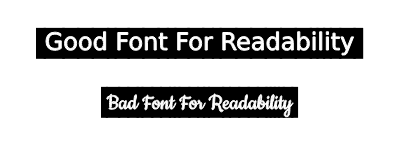
Font Selection
Font selection can make a huge difference in the readability of text for those that are visually impaired. Common guidelines suggest to restrict the number of fonts to one for bodies of text and one for headers to avoid confusion. Additionally, sans-serif fonts are easiest to read and should be, at the very least, 12pt in size. For emphasis of standard text, bolded styles are far easier to read than italics.