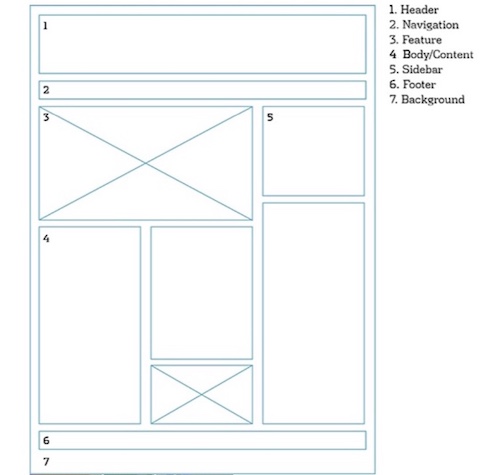
Design Template by Anonymous
Implementation
How to implement Page Layout
Implementing proper page layout is as simple as breaking your website structure into various components using a system of conventions, grid systems, and tags. Following the standard convention of western reading from left to right is expected by users and if not followed will confuse users and turn them away from your website. Following the breakdown of a webpage helps organize where the different parts of your webpage will be located. In addition, the user of a grid system cleans up the edges of your page and lines each component up smoothly.
If your site will be viewed on a mobile device or a large monitor is is also important to think about what type of grid system you want to use. In today’s environment, utilizing a flexbox display system is almost guaranteed so your webpage automatically adapts to the screen size it is being viewed on. This ensures proper layout on any device. The grid display is also used but is seen less and only on pages that are primarily viewed on a monitor or laptop. Lastly, many people forget that the whitespace and background are a part of page layout. Almost as important as the actual text information. Using proper whitespace breaks up the text, allowing the user to visually separate each section into small chunks that are easily understandably and readable.

Header
The header section of a webpage plays a crucial role in structuring
content, enhancing SEO, and creating a strong first impression. The head tag,
though not visible on the page, contains metadata like the title, styles, and
scripts, which are essential for proper webpage functionality. The h1 to
h6 tags define headings, with h1 being the most important for search
engines and accessibility, helping to establish a clear content hierarchy.
When it comes to positioning, sticky headers remain fixed at the top as users scroll, improving navigation, whereas sticky scrolling windows allow sections of the page to stay in view while the rest of the content scrolls. Proper use of these elements enhances both user experience and website structure. As seen in the pictures, the header contains a big title "American" with the iconic logo of the company. The picture above is looking at the inspect window and you can see the meta text that is increasing the SEO of this website.


Navigation
Webpage navigation is a fundamental aspect of user experience design, helping
visitors find their way around a website quickly and intuitively. The nav
element is used to define the primary navigation section of a page, typically
located in the header or just below it. This area usually contains a set of links
to key sections of the site, such as Home, About, Services, and Contact. To
improve usability, navigation menus are designed to visually stand out—often using
contrasting colors, larger fonts, or distinct styling—so users can easily identify
and interact with them. Navigation links should always appear clickable, to draw
the user’s attention and direct them to further explore the website.
In more complex sites, breadcrumb navigation may also be used. Breadcrumbs display the user’s current location within the site’s hierarchy, allowing for easy backtracking to previous sections. This is especially helpful in large, multi-level websites as it enhances both user location and accessibility. Overall, effective navigation design ensures users can move through a site efficiently and with confidence.


Feature
The feature section of a website, often defined using the section
tag, serves as a focal point that captures the user”s attention and
encourages them to explore more of the site. This part of the layout typically
appears near the top of the homepage, underneath the navigation section, and is
designed to make a strong visual impact. It sets the tone for the rest of the
site and often highlights key content, services, or promotions to immediately
engage visitors. To create visual interest, the feature section often includes
vibrant visuals and unique typography, helping it stand out from other parts of
the page.
Examples of common feature section elements include slideshows, which cycle through images or messages, and picture arrays, which display a collection of eye-catching images in a grid or carousel format. These elements are not only visually appealing but also help communicate the website”s purpose or brand identity right from the start. American Airlines does this by using bold text such as “Book Hotels and Level Up Faster”. This type of messaging evokes a game like sense into the user and urger them forward to book flights, hotels, and other trip necessities through American.
