Design Template by Anonymous
Introduction to Flexbox
Prior to 2009 the traditonal way to align items within containers was using flaot and positioning, then in 2009 Flexbox was introduced and changed the fundemantals of CSS positioning. Flexbox has a large number of sub properties which are capable of modifying object positions using far less code. Using traditional methods the following tasks were not easy to complete without using multiple containers to artificially resize objects.
- vertically centering an object within a parent container
- using flexible sizing to make multiple objects the same size within a parent object
- allowing for multi column pages with different amounts of content
Flexbox is able to easily achieve all of these previously difficult tasks. In addition to this flexbox is more responsive and has a simpler code structure.
Traditonal Methods: Float & Positioning
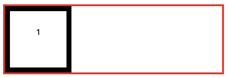
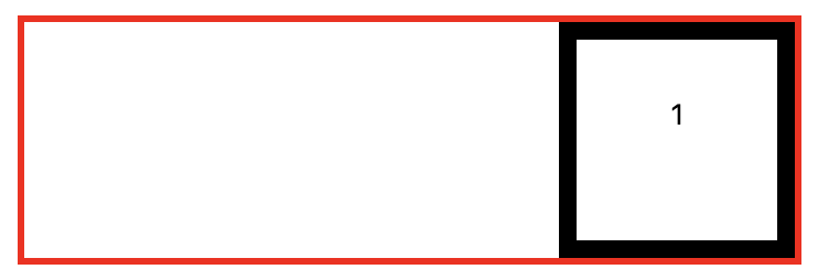
Using the Float property, objects can be 'floated' to the left and right edge of their parent container. The center tag can be used to position objects in the middle of a parent object as the float element dose not support center positioning. Another factor with the float property is if you apply it to an img tag for example, the caption will wrap itself around the img unless you apply the clear property to the caption. This applies to many other linked elements.

float: left;

float: right;
What Changed With Flexbox
Rather than moving elements based on their left right alignment using the float element, flexbox uses an axis based approach for flow direction. By default this is set to row (horizonal) but can be changed to column for vertical positioning of elements within a container. Flexbox also comes with many more properties.

justify-content: center; Prior to this centering
an object within a container had to be completed using the center tag.
This new property assigned with flexbox, called justify-content: ; has many other properties
which are touched on later in this tutorial.