Design Template by Anonymous
Definitions and Terms
There are many different definitions for what typography is, but the best definition I’ve found is that typography is "the art of arranging letters and text in a way that makes the copy legible, clear, and visually appealing to the reader".
The choices you make in regards to typography can have a huge impact on the usability, aesthetics, and professionalism of your website.In this tutorial, I’m going to discuss the different definitions and terms used for typography and typographic elements, I’m going to share how to choose the correct fonts for your website, and I’m going to share different ways to organize and adjust your fonts.
Typefaces vs Fonts
Before I explain the rules of typography, I want to share some basic definitions that are used when talking about type. This will give you the background needed for the concepts I will cover later in my tutorial.
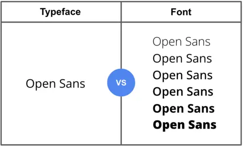
A typeface can be defined as a family of letters, numbers and symbols that make up a font. Within a typeface there can be multiple fonts, This is illustrated in the image below. Within the typeface Open Sans, there is Open Sans thin, Open Sans, Open Sans, etc.
A font can be defined as an individual within a typeface family, for example, one individual font in typeface Open Sans is Open Sans bold.
The relationship between a typeface and a font is very similar to the parent-child analogy used when explaining a file system. The typeface in this case, would be considered the parent to the font.

Anatomy of Fonts
Another aspect of typography that is important to learn is the anatomy of typefaces. The structure of a typeface’s anatomy has a huge impact on the level of readability of a font. Knowing the basic terminology will help give you the background needed for the concepts I cover later on in my tutorial and make you more aware of the factors that contribute to a good typeface.
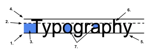
- The baseline is the invisible line that letters, numbers, and symbols sit on in a typeface.
- The meanline is where lowercase letters should meet their maximum height.
- The x-height is where lowercase letters should should reside.
- The cap-height is where uppercase letters should meet their maximum height.
- The Descender is the part of the letter that extends below the x-height.
- The Ascender is the part of the letter that extends above the x-height.
- The Counters of a typeface are the areas in a letter that is either fully enclosed or partially enclosed (examples of letters that include a counter are A, B, D, O, P, Q, R, a, b, d, e, g, o, p, q)

Above is a visual example of the anatomy terms I mention. The position and appearance of these elements greatly impact readibility and the accessibility of webpages, which I will explain more about in the choosing fonts section.
Typeface Classifications
The last thing you need to know about typefaces, is that there are five main classifications. Each classification has their own set of characteristics and distinct appearance. Knowing the different classifications will help you easily identify and find specific typefaces you may want to choose for your website.
- A Serif font has strokes that lead off of the letterforms called serifs, they are mostly used for printed media, but occasionally show up digitally. There is also another variation of serif fonts called slab serifs that feature slabs instead of serifs. Some popular examples of serif fonts are Times New Roman and Cambria.
- A Sans Serif font is a font without the serifs. They are used most commonly in digital media because of how easy it is on the eyes. Some popular examples of sans serif fonts are Helvetica and Verdana.
- A Monospaced font is a font where all of the characters em-spaces are the same size. They were originally created for typewriting and typesetting for computer code. They are not considered the best for readability, but can be found throughout the web. Some popular examples of monospaced fonts are Courier and Roboto Mono.
- A Script font is a font that resembles handwriting, they can be very formal or very casual. They work best when used for headlines or larger text due to their intricate nature. Some popular examples of Script fonts are Brush Script and Murray hill.
- A Display font is a font that is bold and striking, they vary in appearance, they are used for headlines and larger text. Some popular examples of Display fonts are Willow and Cooper Black.
These classifications can also overlap with each other, for example courier falls under the classification of a monospaced font and a slab serif font.