Design Template by Anonymous
Sizing, Organizing, and Adjusting Fonts
The last important thing you need to know about typography in web design is how to correctly size text, organize text, and adjust fonts in order to maximize legibility.
Size of Text
To ensure that text on your website is legible for users, the font size for body text and headers should fall into the range listed below.
- Laptop font sizes should be between 21px-27px (1.3125em-1.6875em)
- Tablet font sizes should be between 20px-25px (1.25em-1.5625em)
- Mobile screen font sizes should be between 16px-20px (1em-1.25em)
This recommendation however can be quite loose because the size of fonts can vary from typeface to typeface. One way I try to make sure my fonts are at a readable size is to compare it to basic, widely used fonts such as Arial or Helvetica. If I notice that the suggested range isn’t matching up to the common legible fonts, I will adjust it.
Organization of Text
When arranging text on a webpage it’s important to consider hierarchy. The size of the text on your page should be in this descending order:
- Heading
- Subheading
- Body paragraphs
To make sure there is consistency with the size and appearance of headers, sub-headers, and body paragraphs, I would create a word document where you can document the "type rules" you make for the text on your website and make sure that you are consistent with the rules you create for yourself throughout the website
When organizing text into a hierarchy, it also important to alter the appearance of the font itself. Just changing the size of the font doesn’t always result in an effective hierarchy. This can be done in a variety of different ways.
- If you selected a typeface with multiple fonts, you can change the weight of the font to be more bold (see the difference between Open Sans medium vs Open Sans bold in the previous example).
- You can utilize contrast, To test whether the colors you picked work, I recommend visiting https://color-contrast-checker.deque.com/. You can test out multiple color combinations and it will give you suggestions for other colors to use instead if the ones you selected don’t work.
- You can utilize white space between text. By creating a small gap in-between the headers, subtitles, and body text it breaks up the text into understandable chunks and makes it much easier for the user to scan the page.
Another important aspect to pay attention to is line length of body text. The ideal line length range for web page text is 45 to 80 characters per line. Anything above or below this threshold can be hard to read and cause fatigue in the reader.
Adjusting Fonts
If you choose a font that has an issue with its readability, such as the letters being too close, far apart or if you’re having issues with the vertical spacing of paragraphs, there are a few ways you can adjust the text in your website.

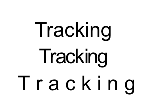
One way you can make a font more readable on a webpage is to utilize tracking. Tracking is when you increase the spacing throughout a word or sentence. With tracking, you can space out the letters in a sentence to make them more readable. This can be done using css. It is important, however, to make sure that you don’t overdo it. It is best if you set the range from 0.05em to 0.12em.
h3 { letter-spacing: 0.05em; }

Another way to make a font more readable is through kerning. Kerning allows you to adjust the space in-between two characters. This can be useful if you use a font where certain letters melt into each other. This can be done in CSS using font-kerning and text-rendering properties. You can also utilize the Javascript library kerning.js.
#text { font-kerning: normal; }#text { text-rendering: optimizeLegibility; }- kerning.js: A JavaScript library that gives you control over kerning on your websites.

Leading is the vertical spacing of text. Sometimes for certain fonts when they’re in a paragraph format they need to be spaced vertically to make them more legible. It’s important to ensure that the line Height Is 120% of Font Size to meet accessibility guidelines (12px line height for a 10px font).
div.a { line-height: 120%;}