Design Template by Anonymous
Selecting Typefaces
Things to keep in mind before choosing a typeface
When choosing a typeface, you should limit your selection to three or less. This allows you to avoid creating confusing font hierarchies and allows you to more easily create a cohesive website. It also can make a website appear more professional. Because of this general guideline, it’s best practice to choose typefaces that offer a variety of different fonts.
When choosing fonts, you need to also consider the type of website you’re building, the message that the brand wants to convey, and the aesthetic. Choosing the wrong typefaces for your project may make the website appear unprofessional and confuse users.
For example, if you were to visit a law website and they used Comic Sans in their body text or headers, you probably wouldn’t trust that law website website as much as you would if they used a font like Times New Roman. However, if the website was a fun themed coffee shop, you would probably not find it odd at all.
Where to find fonts
If the default web-safe fonts do not fit your needs, there are multiple websites where you can find licensed fonts. Before you use the fonts on your website, check whether they are licensed for commercial use and learn about the licensing requirements needed to use the font on your website.
Below are some websites I found that are great resources for finding fonts
- https://fonts.google.com/
- https://fontsforweb.com/
- https://www.fontsquirrel.com/
Choosing a Legible Font
When choosing a font for the text on your website, its important to choose a font that is simple and easy on the eyes. Fonts that have unique shapes and other decorative elements can be hard to read when sized down to a readable size, this can cause fatigue when reading and can be hard for some demographics to read (people with visual impairments).
Below is a list of accessible fonts according to the ADA.
- Times New Roman
- Verdana
- Arial
- Helvetica
It is important to not use images of text on your website. They may not be visible to mobile users, may not be accessible to individuals with visual impairments, and could be inaccessible for people with screen readers. A solution for this issue is to set copy as live text, howerever, if using an image of text is necessary, you should provide alt text for those images.
If you decide you want to use a display font or a script font on your website, you should only use it for large headers or titles. If you use display fonts and script fonts as body text it can cause reading fatigue in the user and can be hard for some demographics to read, such as people with visual impairments. It is also important to make sure that the display or script font you choose is readable.
Some signs that a font is readable:
- It has a tall x-height, this indicates that the letters are very legible at small sizes.
- A height difference between ascenders and capital letters, this prevents confusion between letters when scaled down, an example of this would be a difference between a capital i and a lowercase L.
- It contains distinctive letters, this can prevent users from confusing similar letters like o, e, c.
- It has adequate letter spacing.
- It has easy to differentiate characters (for example, a difference between p and q).
Some signs that a font is not readable:
- Thin weights on smaller font sizes, this can impact readability and make it hard for people with visual impairments to read.
- Narrow-width fonts, this causes crowding and can make characters bleed into each other.
- Block capitals, it harder to read capitalized letters at smaller sizes.
- Fonts where the letters mirror each other, this can cause confusion while reading.
Later in this tutorial, I will cover ways you can correct some of these issues if you find a font you want to use, but it has minor readability issues.
It is also important that when you’re choosing legible typefaces, to make sure that they have a variety of different fonts. This is especially important when choosing fonts for body text. Having multiple fonts allows for greater diversity of options when deciding what best fits for your website, it also keeps the aesthetic of your website consistent.
Choosing a Decorative Font
When you’re choosing a font for the websites name or a more artistic visual aspect of your website, you can look for a fun script typeface or a display typeface. This isn’t required for every website, but sometimes you may work with a client that wants something more unique.
It’s important when choosing a decorative font that you work closely with the website owner. This is to ensure that the font you choose accurately reflects what the owner wants the message or aesthetic of the website to convey.
If you decide you want to use a display font or a script font on your website, you should only use it for large headers or titles. If you use display fonts and script fonts as body text it can cause reading fatigue in the user and can be hard for some demographics to read, such as people with visual impairments. It is also important to make sure that the display or script font you choose is readable. Script and Display fonts can either be extremely readable, for example, (Luckiest Guy or Cookie) or they can be harder to read (Bangers or Parisienne). Harder to read typefaces should be avoided, unless there are more accessible fonts within the typeface or you’re able to adjust the font you want to use, which is a topic I will cover later on.
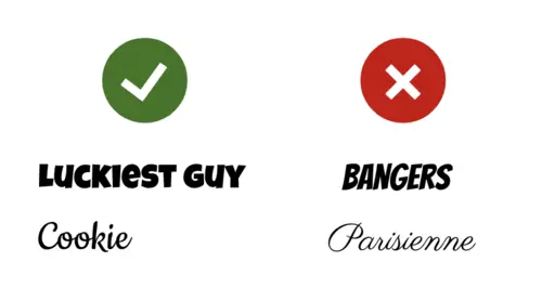
It is also important to note that if you decide to use a decorative font, you may need to purchase the font if you are using them for commercial purposes. Many fonts are free to download for personal use, but this doesn’t mean that it is ok to use on a professional website you’re using. Always double check before downloading a font for commercial use.
Examples of Websites That Utilize Readable and Decorative Fonts
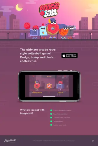
The website Boogieball is an example of a website that utilizes a decorative display font along with a legible sans serif font. The title of the website is located in the top-center of the page and it has letters overlapping other letters along an image of a basketball hitting the side of the letters. The font is not extremely readable, but it doesn’t convey any new information that may be important to the webpage viewer. It instead gives you a sense of the type of mobile game that is being advertised. The rest of the text that shares information about the game is in a sans serif font that is easily readable.

This is a random law webiste that I found while searching for webistes examples to use. It utilizing only legible fonts, It has a large display font but the body text is a typical sans serif font. The call to action button is a slightly tracked display font, which I think is an interesting tactic to use typographic wise to catch a user's eye. I do think however, this is not the best choice they could've made readibility wise. I think if they tracked it slightly less, like the free consultation text in the top right corner, it would be more effective. Most websites you will encounter, if they're strictly information based, will look a lot like this.
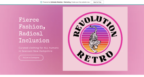
This is the homepage of a thrift store located in Durham that you may have been to, that I found. It’s main body text is a basic sans serif font, but It uses a fun, organic looking legible typewriter font for it’s headers. It successfully ties in the retro theme of the website without sacrificing its readability.
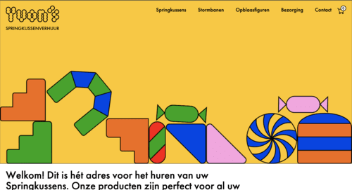
Out of all of the websites, I found while looking for examples of websites that utilizes display fonts effectively, I think this is one of the most unique ones I've found. This is the homepage of a dutch website that rents out bouncy castles. The font utilized throughout the headings and body text is a, sans serif font. For the subheadings a tall display font is used, and for the logo a very bubbly display font is used. I think this instance of a display font is one of the less readable examples i've found. The s and the apostrophe used in the font is very abstract. At first glance you may even mistake it for a decorative element than a letter that is apart of the word displayed. I think the typography in the logo of this website is a great example of the type of decorative typefaces to avoid when choosing decorative fonts for your website.
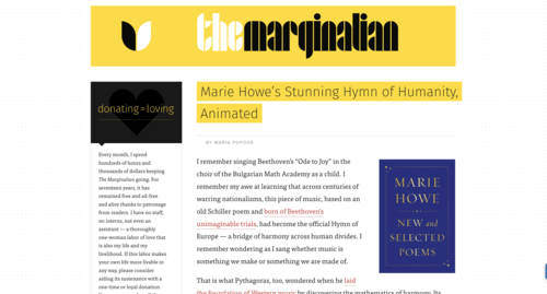
This website is a small philosophy website I found that is run by just one person. the main body text throughout the website, is a readable serif font. and the title is a midcentury modern style display font. Despite the fact it has mirroring shapes, letters are extremely close together, and no counters, it is a very readable and a great example of a legible display font. This is because of it has a clear cap-height, clear x-height, clear descenders, and clear ascenders.
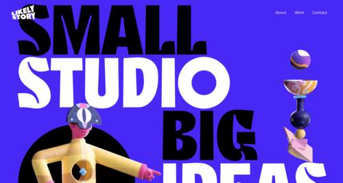
This website is a website for a design agency called Likely Story that based in England. The font for the body text and subheaders are a sans serif and the headers and title are in a tall thick display font. Despite the unique apertures and that the font is completely capitalized in the headers, which is usually an indication that it is not a readable font, it is still an extremely readable font because of its clear counters, and consistent spacing. The sense of hierarchy is also very strong in this website, with its contrasting colors, great use of whitespace, its use of a combination of bold and regular text, and its placement of other elements. This website is a great example of how to utilize larger display types along with smaller body text.
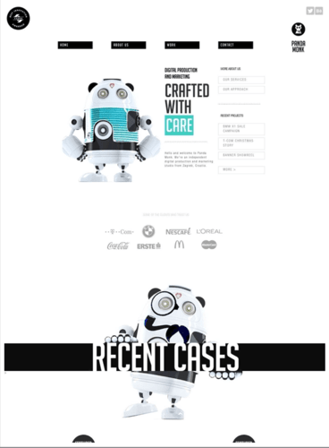
The website for digital marketing agency Panda Monk, utilizes a display text in its titles, headings, and uses a small tracked version for the body text. Since the display text they used is highly readable it doesn’t interrupt the users experience navigating throughout the webpage.
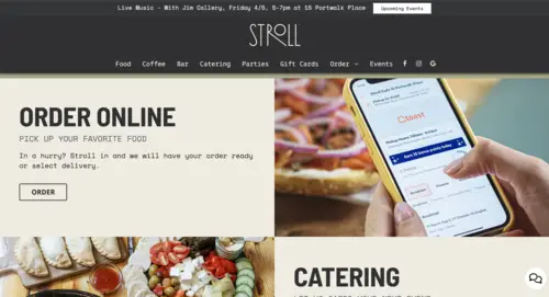
The website for Stroll cafe in Portsmouth utilizes decorative display font for their title and headers. They also used a kerned or tracked monospace font for their body text. Both fonts they chose are highly readable and doesn’t impede on the users ability to navigate throughout the website.