Design Template by Anonymous
Trends of 2000 - 2015
Early - Mid 2000s
With the invention of flash and a rise in usage of CSS, developers were able to do so much more with their websites than with basic, 1990s style, HTML code.
Info Dump
Since Flash was on the rise at this time, it was common to see an overloaded homepage on a website. Flash made it easy for developers to add multimedia elements to web pages, and designers took this and ran with it. Many early 2000s websites’ homepages are a mishmash of too much text and out-of-place images. The screenshot below will provide an example of what website layouts commonly looked like around this time.

Whitespace
As developers gained a better understanding of color psychology, which refers to the study of how colors affect perceptions, the use of whitespace exploded. White space is an ever-popular trend under the UI umbrella and its importance lies in readability and ability to draw a user’s attention to content.
Late 2000s - 2010
Skeuomorphism
In the late 2000s, the web design field saw a rapid rise of Skeuomorphism. Skeuomorphism is a design concept in which elements of a website represent real-world items. An easily understandable example is the recycling bin icon on your machine. Skeuomorphism came in the form of informative icons, such as the recycling bin example, and realistic shadows. These elements of realism replaced the awkward, cartoonish pictures we saw before. This helped users become more comfortable navigating sites, as the informative icons give a clear message as to what the button does.

HTML5
With the release of HTML5, developers could create more complex layouts for their websites. This, though, didn’t always mean fitting as many elements onto the web page as possible, as we saw in the early 2000s. This advancement provided developers with tools such as native audio and video support, temporary data storage, UTF-8 encodings, which helps to save space, and the ability to draw shapes such as circles, triangles and rectangles. This is an important milestone in the timeline as this is when we actually begin to see UX elements incorporated into websites.
2010 - 2015
Responsive Design
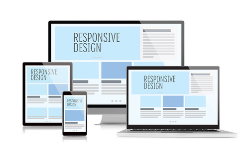
With the release of the iPhone in 2007, people started to browse the web more with their phones. This called for the emergence of responsive web design. Responsive web design is when user interfaces are encoded to adapt to different screen sizes, which keeps the UI consistent across all sized screens. The implementation of responsive design gained great traction, and in 2014 became the standard. Websites that did not use responsive design to format their sites saw their traffic plummet.

Minimalism
Minimalism is a design strategy that aims to create compelling websites with less decoration. Due to the rise in mobile browsing, more scrolling than ever was going on. This forced web developers to revert to a more minimalistic web design in order to facilitate responsive web design. Another reason minimalism gained popularity in this time frame was the fact that many brands were adopting a clean and modern aesthetic for their marketing campaigns. This can be attributed largely to Apple, as they were, and still are, a big name company for setting design choices.
