Design Template by Anonymous
Mobile-First Design
Mobile-first design has gained significant traction with the world’s trend toward phone supremacy. This new process allows web designers to create the product design for mobile devices first, then further implement it into a tablet and desktop view. To best showcase this design technique, I’m going to break it into separate processes and explain them more in-depth. These steps are all coming from UXPin, and I will be interpreting them in how I would go about tackling them. They will be addressed in the order below:
- Content Inventory
- Visual Hierarchy
- Mobile View
- Tablet View
- Desktop View
Design Process
Step 1: Create a Content Inventory
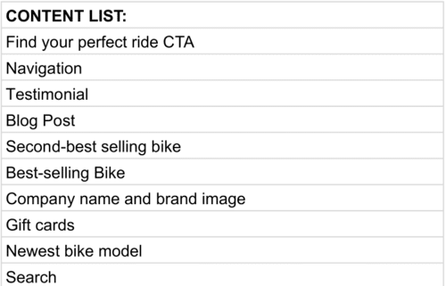
A content inventory should consist of all the necessary elements you want to have on your page. This list will end up becoming the backbone of all your work throughout the design process. Be as specific as possible when naming elements, and break all large categories into smaller, more descriptive titles. Every ability to your mobile website should be contained here.
Step 2: Create a Visual Hierarchy using content inventory
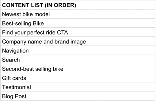
Now that we have created a content inventory, rearrange all of the content in order of their importance and role in functionality. This is where the layout and functionality of your mobile website will be distinguished. Content located at the top of the list should be placed front and center of your screen real estate, while the rest can be made accessible through navigational means.
Step 3: Design the Mobile View
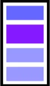
This is a very general outline of what your mobile website should appear as. The top section should contain your name and branding, purple being your #1 priority item, and the lavender sections below following as your #2 and #3 items respectively. This pattern will continue as you scroll down further the website. The design and visuals of the website can be left open to the creator, but make sure to follow proper responsive and mobile design practices.
Step 4: Design the Tablet View

Here is the tablet view. This is going to end up being very similar to that of your phone view, with the main changes coming through scaling and the sizing of content. Everything will likely be slightly bigger, but the same amount of content should be on the page as the first design. Color codings to design elements follow as before.
Step 5: Design the Desktop View
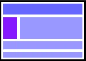
Lastly, continue porting your phone website to the traditional desktop version. By this point in the design process, you will likely already have a visual of what you want this to look like in your head. From the example image I have provided, I think it is fair to place your top priority item into the larger lavender box next to that of the purple. This is a choice ultimately for the designer, but I believe the largest box has the largest attraction on the user.
By completing all of these steps, you will be left with a product that encompasses all mediums of accessing a website. The mobile website being your foundation will make it the highest quality of the 3 and further push the mobile-first perspective. If making any changes to the design over time, follow the same order of phone-tablet-desktop. Keeping the mobile integrity is most important here. Lastly, play into your eye of design and have fun with it. If something looks more appealing to you, and a sacrifice of visuals must be taken to enforce functionality first, do as you see fit. This is only a template, and make it your own.