Design Template by Anonymous
Introduction
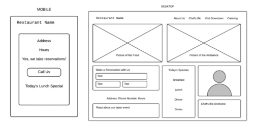
In the modern day where phones have become the dominant technology for taking in media and receiving information, and the desire and need for mobile websites has grown exponentially. Along with the need for a traditional desktop website, a new requirement has arisen surrounding the necessity of a mobile-driven page as well. No longer is a personal computer or laptop the common method for surfing the web, as in 2022, 54% global website traffic is being conducted through mobile devices. (Tidio) This is a significant change in the web design industry, as companies are now being forced to adapt to stay relevant. In this tutorial, I hope to convey what Mobile Web Design is, and why it is a crucial aspect of the internet and mobile usability moving forward. To prove these two points, I will dive into the specifics of Mobile-First Design, Reactive Design, and Accepted Practices when it comes to designing a mobile website effectively. Throughout all of this, examples will provided to help you understand and visually interpret the do’s and don’ts of mobile web design. I hope you find this informative and enjoyable to read.
What is Mobile Web Design?

Mobile Web Design is the process of creating and optimizing websites specifically for viewing and interacting on mobile devices like a smartphone or tablets. These sites should be responsive, user-friendly, and visually appealing all while placing the most emphasis on functionality and ease of use. Over the years, two processes have been distinguished when creating a mobile website, and a decision has to be made before any designs are implemented.
Mobile-Specific Site
The first option is a designated mobile and desktop website. In this practice, the desktop website has often been implemented prior and the individual hopes to port this to be better fitting for the restraints imposed by a mobile device. The mobile site should follow the same design choices as the desktop, but be separately coded to do as such. Mobile sites will often contain the same URL as their desktop counterpart but contain a “m.” prefix. Accessing the desktop version of a site on a mobile device should automatically redirect the user to its mobile copy. This allows for tailored experiences for mobile users, but comes at the cost of multiple web addresses, cost, and the inability for content updating to be streamlined, as you will come to see in a reactive design approach instead.
Responsive Site
That brings us to the second option, a responsive website. Responsive websites have become the accepted norm for implementing a mobile website and for much good reason. With a responsive website, your desktop and mobile site will share a common URL, and the content should appear the same between both versions. This is done through many techniques, some of which will be conveyed later in the tutorial. Ultimately, your desktop website should be able to scale down the necessities of a mobile screen, and vice versa. Content should appear different in its presentation and implementation, but the content should transfer and be the same. The benefits are immense in this choice, and many of the downfalls to an individual mobile site can be completely avoided. No longer will you have to learn about updating two separate pages, as any changes made to the desktop page will be reflected on the mobile version. The cost of maintenance goes down significantly, as only one team is needed to manage both of your web presences. As I think responsive design is the best way to attack mobile web design moving forward, I will further delve into it throughout this tutorial.
Why is it important?

Having a mobile website with good mobile web design is necessary because without it you will fall behind. For business and commerce, companies like Amazon and Walmart have come crashing down on small businesses ever since the digital shopping emergence in the last 10 years. This change has become even further accelerated with the instance of COVID-19, forcing all to become more reliant on using the web to complete daily tasks and continue with their livelihood. These giants have mastered efficiency, and if small businesses and creators can’t compete, they will be lost in evolution.
Proving my point, 87% of small businesses do not have a mobile-friendly website implemented. This must change. Without a mobile website using proper mobile web design techniques in place, your image can be damaged. Engagement will significantly drop between the host and their audience. For a business, this can be a loss of revenue and the stunting of growth. If the user doesn’t find your user experience interesting and easy to use, they will move to someone else's that is.
When you do have a mobile website with the proper techniques, the chance of success increases significantly in all fields. Higher retention and conversion rates can lead to higher sales. Your mobile website will become more likely to reach the top of search results, pushing growth in a positive trend. You and/or your brand's reputation will be increased overall. People will want to return to your page for further interactions and business. A good mobile website can only bring benefits, and without it, the downfalls are much more significant.