Design Template by Anonymous
Color Schemes
When designing websites professional designers do not simply use one or two colors. They use a wide variety of colors that work together harmoniously. These groupings of colors are known as color schemes. There are already a number of proven harmonious color schemes and their types are listed below. Another important term to understand is color palette. Color palettes refer to the actual colors used in a site while color schemes relate more to the framework of colors used in the site.
Types of Color Schemes
Monochromatic Color Schemes
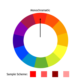
A monochromatic color scheme is one of the simplest color schemes. Only one hue and variations of that hue are used in the scheme. The colors in the scheme will vary in saturation and brightness but will all have the same hue. The benefit of this scheme is that it is very easy to implement. However, it is a fairly basic scheme which could lead to rather simple designs.
Analogous Color Schemes
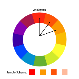
Analogous color schemes usually consist of three colors located adjacent to each other on the color wheel. Like monochromatic color schemes, analogous color schemes are fairly easy to implement. These schemes work well with grays and whites mixed into the color palette.
Complementary Color Schemes
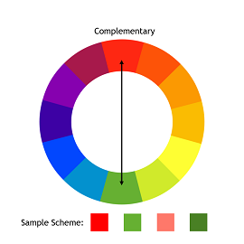
Complementary color schemes consist of colors that are located opposite of each other on the color wheel. These opposite color pairs provide the baseline for the palette. Complementary schemes are useful if one wants to maximize contrast within their web design.
Split-Complementary Color Schemes
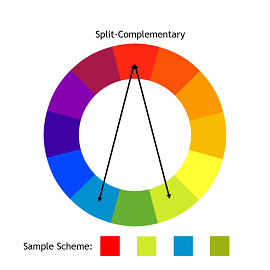
Split-complementary color schemes are similar to complementary color schemes but instead of using the direct opposite color, colors adjacent to the opposing color are used instead. This creates an isosceles triangle within the color wheel. This color scheme is useful if one is desiring to soften the contrast within their design. Split-complementary color schemes have less contrast than complementary color schemes.
Triadic Color Schemes
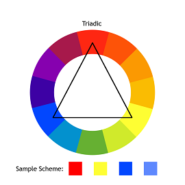
Triadic color schemes consist of colors that are 120 degrees apart on the color wheel. The colors used connect by an equilateral triangle. It is easier to make a visually appealing design with this scheme than a complementary scheme, making this a fairly useful scheme for designers. This scheme also maintains harmony and sufficient levels of contrast
Tetradic Color Schemes
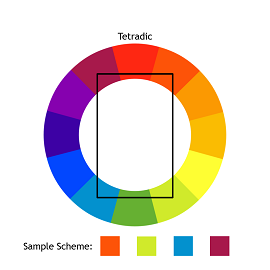
Tetradic color schemes use four different colors that are separated in a rectangular form. When using a tetradic scheme it is best to choose one color as the dominant color as this can allow for richer and more interesting designs. One of the problems with implementing this scheme is establishing the balance between warm and cool colors while also making sure there is sufficient contrast. Choosing a dominant color can help reduce the likelihood of these problems, but they are still important factors to consider. This is probably the hardest color scheme to implement, but it can produce some of the most interesting and unique designs.
A note on Gray and White
Including various shades of gray and white is useful when creating web pages. Whites and grays can be used as suitable background colors and will not distract the user from more important aspects on the page. These colors also can create an illusion of openness on a page.