Design Template by Anonymous
Good vs. Bad Navigation
Effective navigation helps users find what they need quickly, improves accessibility, and enhances the user experience. Let's examine two real-world examples:
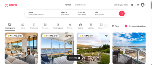
Good Navigation: Airbnb
- Minimalist design with a prominently placed search bar.
- Filters for price, property type, and amenities are intuitive and responsive.
- Consistent layout, color scheme, and font choices across all pages.
Bad Navigation: Yale School of Art Website
- Chaotic and unpredictable layout confuses users.
- Lacks a clear menu or navigation hierarchy.
- Poor contrast between text and background reduces readability.
- Fails to meet basic accessibility standards.

Takeaway: While creativity is important, functionality and accessibility must come first in any navigation system. A clear structure supports better user interaction and satisfaction.