Mobile First Design
What is Mobile First Design?
Mobile-first design is making a website where you design it first for a mobile device in mind. You then work your way up to tables and desktops. It is a good habit to get into because most users access websites on their phones so it guarantees your vision is for the phone and looks good. It is better than going from desktop to mobile because you also don’t have to worry about what to get rid of, but instead you get to think of what to add.
Step-By-Step Guide
Step 1: Plan The Content
Make a list of everything that you want to include on your website such as buttons, headings, images, text, ect.
Make sure to include only the stuff the user will absolutely need to see or use on mobile, and think about what content you can use for later on desktop or bigger screen sizes.
Step 2: Create a Hierarchy
Now that you have a list you should rank everything from most important to least. This hierarchy will make it easy for you when you start to write code for the mobile site. Have the must have content at the top and work your way down from that with the least important features at the bottom.
Step 3: Design the Mobile View
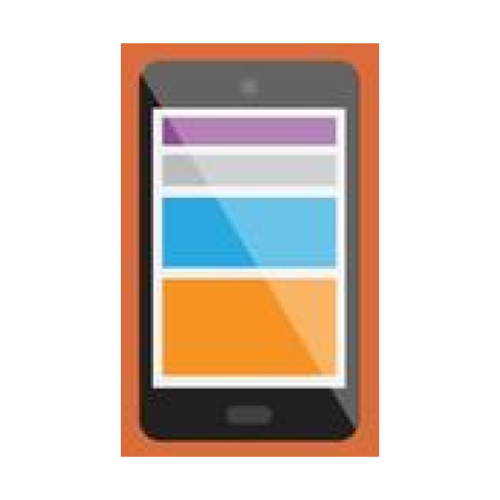
When designing a mobile view you start building your layout for the smallest screens, a phone. You want to use a one column layout with the content stacked, large buttons, and east navigation. Everything should fit the width of the phone screen without needing to zoom or scroll sideways; you only want the user to have to scroll down.
Focus on what matters the most: readable text, tappable links, and fast load times. You want the font to be large enough to see on a small screen and to have the images not be too big.
Step 4: Design the Tablet View
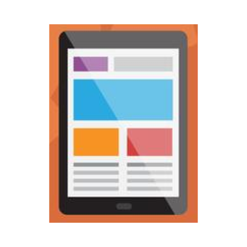
Once you get the mobile version working you can start to make changes for tablets. Tablets have more space so you can make things wider and place items side-by-side. You could keep it one column or you could use two for things like text on one side and images on the other side.
In this step you want to start using media queries in your CSS. You can make it so if the screen is wider than a certain amount to change the layout. You could also make them add padding, make images bigger, and maybe adjust the navigation to be easier with a wider screen.
Step 5: Design the Desktop View

Finally you want to start making a full layout for desktop users. You can now use the full width of the screen, add sidebars, or use multiple columns.
This version can include things like hover effects, bigger images, and more navigation options. Don’t forget that you shouldn't be starting from scratch, you are just adding on top of the mobile design using media queries. You should try to keep the core layout similar, but now you can get more creative and enhance.