Design Template by Anonymous
Introduction to Page Layout Design
Page layout is the arrangement of content and visual elements on a webpage. It plays a crucial role in user experience, helping visitors quickly find what they need and shaping their perception of your product or company.

Page Components
Web developers have learned that most of the time its better to Design pages similarly to reduce the cognitive load that the user will need to effectively use the website. In doing so you might have noticed that most websites seem to always have some components that are present in the layout. Usually there is a place where you see the company name, company logo, or maybe even a hero image. Theres also a place usually where you find what your looking for, that being a document to read or another service that is being provided to the user. And then, there is a place where you might find the copyright symbol, maybe terms of use, cookies information, and possible social media links. These typical areas have names wich will be discussed below.
- Header - area where you will usually sea the company name, company logo or hero images. One of the first things the user will notice.
- Navigation - Is the area where you might first look to see if their are other parts of the page that might be more aligned with what your looking for.
- Content - Is the area where you will go to once you think you might have found what your looking for. Content can range from documents or articles that a person might read to a specific service that Company may provide.
- Footer - s the area located usually towards the bottom of the page. Containing information that a user might not regularly look for but is still easily accessible. This information usually contains but is not limited to copyright, terms of use, cookies information, social media links.
Types of Page Layouts
There are several basic types of page layouts, including:
- 1-Column Layout: One column layouts are one of the simplest page layouts but are also the best for overall accesibility. It is one of the primary layouts used for pagelayouts intended to be veiwed on a mobile device. This is primarily because the viewport of a mobile device is so small. Commonly used mobile-layouts

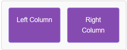
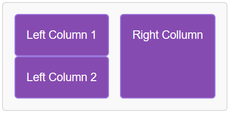
- 2-Column Layout: Two Column Layouts is a step up from the one column layout. utilizing two columns of space instead of one makes it tough for mobile users to have a good user experience.This layout is Commonlyused for blogs and articles.

- 3-Column Layout: Three Column layouts have alot more stuff going on and might not function well with users browsing on a tablet and is more suited for monitor size or larger. Often used for dashboards or news sites.

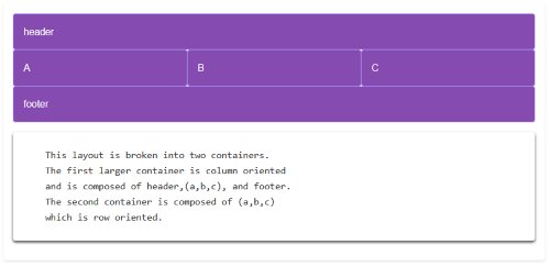
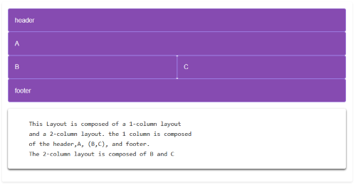
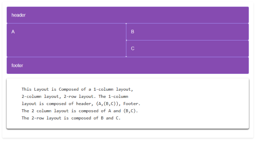
You can also combine these layouts to create more complex designs.

Wireframing
Wireframes are some of the first steps to take when determining what the page layout should be.
Easy Restructuring
- Wireframes allow designers to quickly modify and refine the layout before investing time in detailed design or development.
- Helps teams visualize structure and identify usability issues early.
Defines the Basic page Structure
- Provides a blueprint of content placement, navigation, and functionality.
- Focuses on layout without distractions like color or graphics.
Serves as Documentation
- Acts as a reference for designers, developers, and stakeholders.
- Ensures alignment on what the final product should look like before development begins.
- Width of Content - Keep content width between 66-75 characters for readability.
- Keep things Logical - Follow a logical structure that breaks down content.
- Make Navigation Easy - Ensure easy navigation and mobile-friendliness.
- Emphasize your content - Not emphasizing your content can make the size feel bland and take away from the user experience. utilizing graphics to further get a point accross is great way to further emphasize something.
- Keep a Mobile Mindset - Mobile is ever growing, with a large amount of users browsing on their phones its important to make sure your page layout adheres to a mobile device or that a different layout is used for mobile devices.
Implementing Layouts with Flexbox
Flexbox is a powerful CSS tool for creating flexible and responsive layouts. Flex box comes with a couple of attributes that can be utilized to make sure you get the layout that is intended. Some commonly used attributes with flex box include: justify-content, flex-direction, flex-grow, flex-shrink, flex-wrap, align-items,Align-Content, and Gap. We will discuss these attributes below.
justify-content
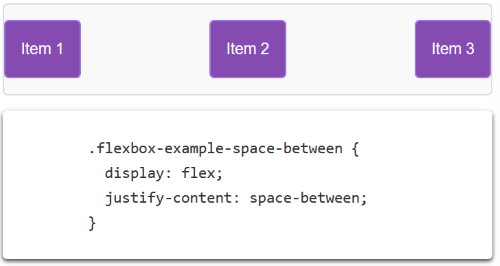
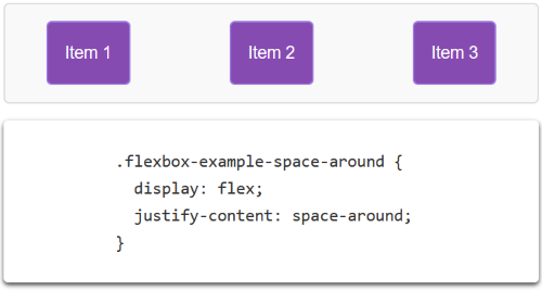
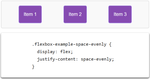
Justify-content determines the way the items are aligned along the main axis of the flex container.

flex-direction
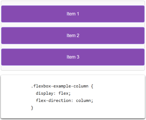
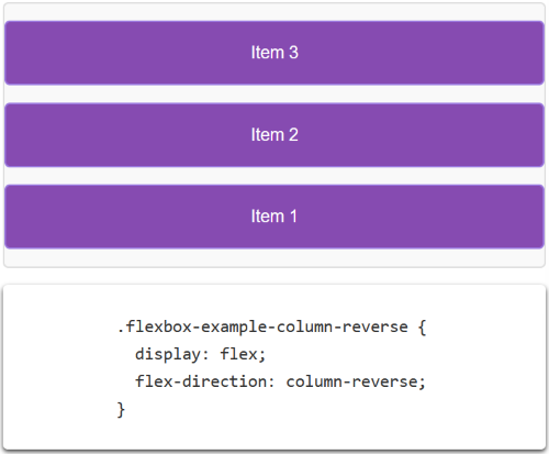
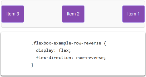
Flex-direction determines the orientation of the main axis of the flex box and the direction of the axis. the default orientation being row where the direction goes left to right.

flex-grow & flex-shrink
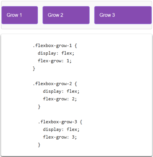
Flex-grow determines the rate at which flex items grow. Somehing with attribute value of 2 will grow two times as fast as an item with a value of 1. Flex-shrink works in the same fashion as flex-grow so something with a flex-shrink value as 2 will shrink 2 times faster than an item with a value of 1.

flex-wrap
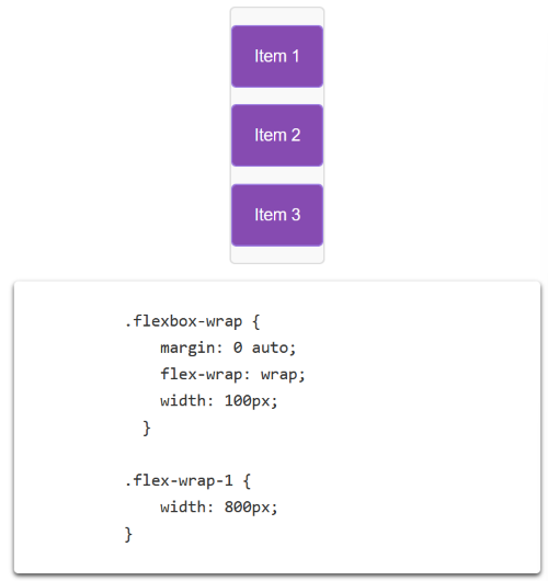
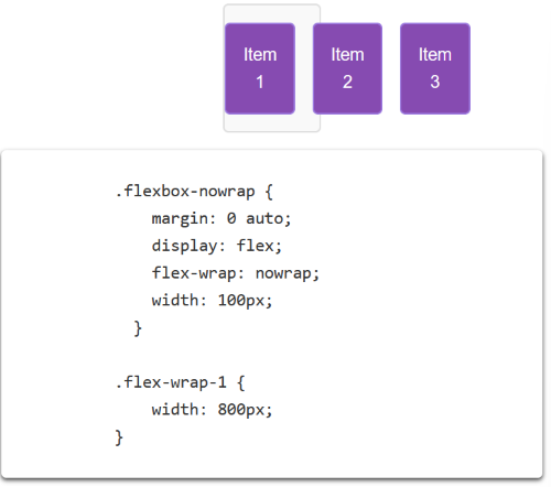
Flex-wrap effects whether items are able to wrap to another row or column in the container if the items overflow that container.

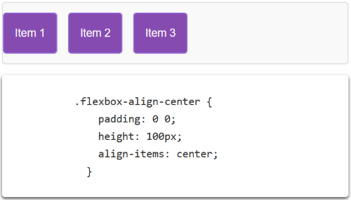
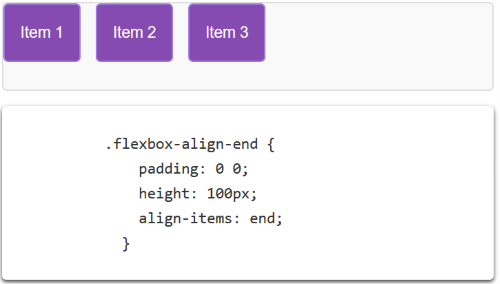
align-items
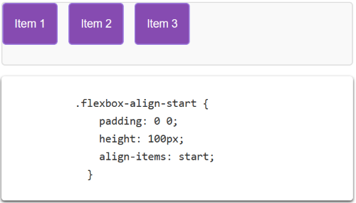
Align-items affects where the flex items are in the cross-axis of the container.

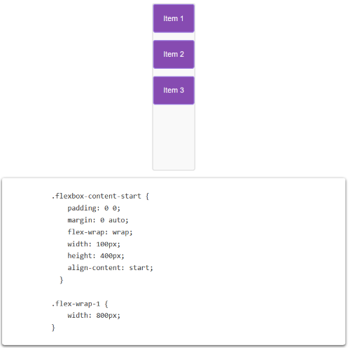
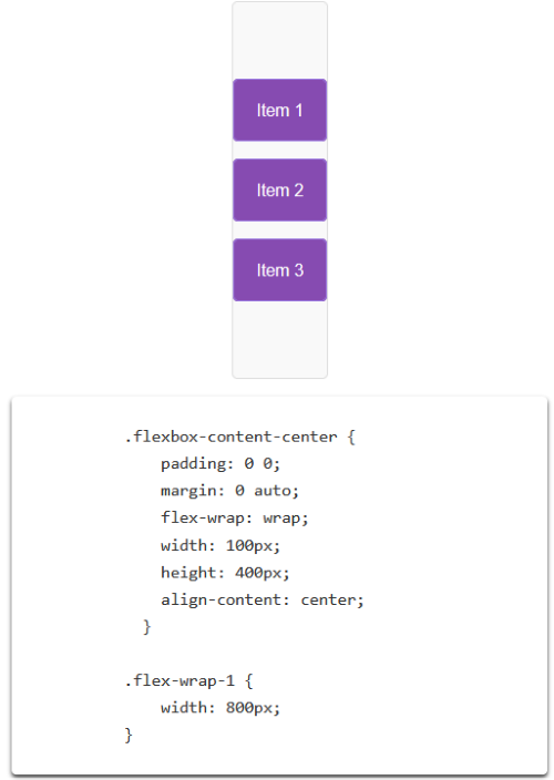
align-content
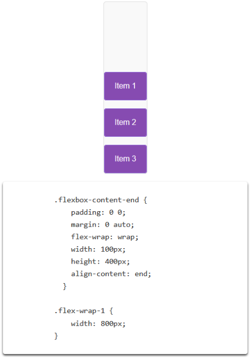
Align Content Affects the items Along the cross axis when flex-wrap:wrap is applied.

gap
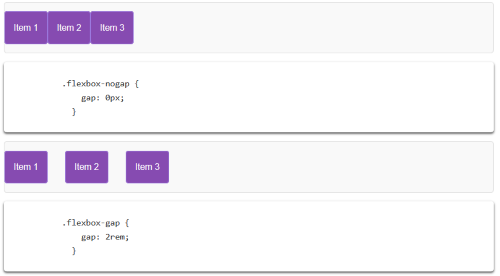
Gap affects the distance between the the flex items. The default value is a gap value of 0.

Example Layouts
A single layout type isn’t enough. That’s where combining layouts comes in. By mixing and matching different structures, you can create a more dynamic and flexible design. For instance, you might use a two-column layout for the main content and a one-column layout for the footer. This approach allows you to tailor the layout to the specific needs of your content and audience
